These are the 10 largest (by population size) cities in Slovenia, ranked by how cool their coats of arms look.
10. Ptuj
I
want to like Ptuj's flag, as it is a fairly classic design. However, I
can't but feel that when Richard the Lionheart was coming back from the Third Crusade, someone in Slovenia just stole his flag. And by
"Slovenia," I mean "The Kingdom of Hungary," which Slovenia would have
been part of during the autumn of 1192 when Richard was crossing
through.
9. Koper
Wait a minute. Have I just entered Koper, the third largest city in Slovenia and the only major city on Slovenia's very small coastline? (the nation is mostly landlocked). Or have I, instead, entered the Smithsonian Institution? Because this looks like the Smithsonian logo. I'm not saying that a sun logo can't be cool. I'm just saying the smiley face makes it pretty non-threatening. Plus this shade is blue is perky and friendly.
8. Kranj
Eagle logos are usually pretty awesome, especially in Eastern Europe. This one almost works, but the light grey and red is just sort of blah. If the colors (or the color tones, at least) were updated, this could rise a couple up in the ranks.
7. Velenje
I don't dislike this one. It's actually pretty modern and sharp-looking. The colors are interesting to me and the symbols are fascinating. I'm not quite sure what it means. I assume the green part are castle walls. That white thing in the middle seems like it's some sort of huge column... or something? I dunno. I guess I could look it up. But I won't. I don't want to kill the magic of my imagination by knowing the truth.
6. Kamnik
This one has boobies on it, so I can't rank it too low. It's not quite a mermaid. It's like a snake lady. Which, if I remember correctly, is called an "Echidna" in western mythology. I guess she owns a castle too, and has some cool dragons as guards. Okay, maybe not cool dragons. Those are just okay dragons. They got nothing on the Ljubljana dragon (see below).
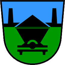
5. Trbovlje
I am not quite sure what this is, but I like it. The colors are interesting/different, the imagery is crisp and modern. It turns the concept that "coats of arms having dragons and birds and stars and castles on them" on its head. As with Velenje, I'm not going to look up what it actually means. Instead, I'm going to pretend it's a coffin traveling on a rail track. Not a huge rail track that a big train would run on. But like one of those small rail tracks that goes through a mine, like the ones in Indiana Jones and the Temple of Doom. Yeah, those little tracks are cool, right?
4. Maribor
I know from the last one it sounds like I might be hating on traditional coats of arms with castles and birds... but I don't really dislike them. In fact, they can look quite cool. If they look like this, that is. Although I'm not exactly sure what that bird is doing. It looks like it's going down pretty fast to that castle gate. Watch yourself, bird. You're about to impact!
3. Novo Mesto
Who is this guy? The king of Novo Mesto? I like him. He's badass. He's got that royal egg and everything. Oh, and I suppose by "royal egg" I mean "Globus Cruciger," the traditional orb and cross used as a Christian symbol of authority. But honestly, it's the Holy Hand Grenade of Antioch. You know it is!
2. Celje
This almost looks like the American flag, which means it looks cool as hell because the American flag is cool as hell. I love this shit! Good work, Celje! It looks like Ulrich II, Count of Celje, really knew how to choose a coat of arms.
1. Ljubljana
The largest city in Slovenia, and also Slovenia's capital, has this as its logo. A dragon on a castle. Who doesn't love that? That dragon is an awesome, classic, and threatening dragon as well. If I were Saint George, I'd be like, "Nope!" If I were some 15th-Century raider about to attack the city of Ljubljana and I saw that they had this as their coat of arms hanging from the walls, I'd think twice about messing with these guys.


.svg/800px-Counts_of_Celje_coat_of_arms_(1-4).svg.png)
.svg/800px-Blason_ville_si_Ljubljana_(Slov%C3%A9nie).svg.png)
No comments:
Post a Comment