By now I have already previewed the question of "Why is a ranking of 50 stated divided into four parts, because 50 is not divisible by four?" What number is divisible by four, however, is 56. Four different rankings of 14 coins = 56 coins. Because in addition to the state coins that ran between 1999 and 2008, 2009 also brought us a final round of six coins - the District of Columbia and United States Territories! Did you forget about that? Yes? No? Maybe?
Anyway! Once we finish the top 8 states, we'll then go into a BONUS ROUND, featuring a ranking of the six US Territory quarters. FUN!
8. Texas
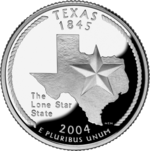
- Depicted: State outline, the lone star
- Caption: "The Lone Star State"
- Year Released: 2004
- Analysis: A big ol' picture of Texas, taking up most of teh coin, and a lone star. Yeah. This was about the only way Texas could go. This is a very Texas coin, and represents Texas about as well as a coin can be expected to. They didn't need to show a cowboy trying to lasso anything too. The only qualm would be that it didn't need the caption at all. We get it. We all know it's the Lone Star state. I can't hate on having a silhouette of Texas on this coin at all, like I sort of do with other states being lazy with such depictions. Texas ALWAYS puts silhouettes of its state outline on things, ranging from key chains to "Don't mess with Texas" tote bags. Texas loves the shape of its state, and it's probably the most iconic state outline. So if any state gets to throw its outline up, it's Tejas.
7. Nevada

- Depicted: Mustangs running, mountains, the rising sun, sagebrush
- Caption: "The Silver State"
- Year Released: 2006
- Analysis: There is a bit too much happening here, but overall I think this is a pretty good coin. The wild mustangs obviously have to stay, but at least one of the other elements could have been taken away and it would have been better. Still though, it would have been nifty to rampant gambling and/or legalized prostitution somehow represented. Why else does anyone go to Nevada? Oh right. "The shows." Suuuuure. Anyway, a lot of states threw horses on their coins. Horse-wise, Nevada did it the best.
6. Arizona
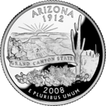
- Depicted: The Grand Canyon, with a saguaro cactus in the foreground
- Caption: "Grand Canyon State"
- Year Released: 2008
- Analysis: I would call this coin "full," but not "busy." While a few other states with so much on the reverse are indeed busy, this is all one iconic landscape, rather than a bunch of random elements thrown together. Because of that, it works and looks good. Once more, I'll say that the motto / caption is totally unnecessary and sort of like when a TV show puts a closed caption on someone who is speaking perfectly fine English for idiots who can't understand a slight accent. And by "slight accent," I do not mean Tom Hardy. That mushmouth needs to be close captioned in every film he's in. I'm not sure I've understood a single word that man has ever said. Anyway, nice coin. Thumbs up, Arizona.
5. North Dakota

- Depicted: American bison, badlands, the sun
- Caption: None
- Year Released: 2006
- Analysis: For your reference, Kansas. THIS is how you make a coin depicting bison. From the side. Grazing. Epic landscape in the background (which I guess Kansas couldn't do because it's flatter than Taylor Swift's ass). Great coin. It's strange to think that the same woman who designed this epic coin also designed the shitty Michigan garbage coin.
4. New Mexico

- Depicted: State outline (with relief), Zia sun symbol
- Caption: "Land of Enchantment"
- Year Released: 2008
- Analysis: Good coin. The state outline has some texture on it so you can see mountains and rivers on it (done much better than New York did their silly river and canal), and the iconic sun symbol of the Zia people (also on the New Mexico state flag) is there. This is a nice coin. I could have done without the caption / motto, but that's just being nit-picky now. If you're going to have an outline of your state on the coin, it might as well look like this.
3. Maine

- Depicted: Pemaquid Point Lighthouse with rays of light, the schooner Victory Chimes (at sea) with some birds flappin' around.
- Caption: None
- Year Released: 2003
- Analysis: HELL YES. Maine knows how to make a coin. Maine knows they are famous for lighthouses, so they put up a damn lighthouse, and added a boat and water in the background because that makes sense and can naturally fit in. No need for an outline of the state. No need to try to work in a state bird, state flower, state insect, state sexual position, or state diet cola as these other stupid states try to do. And the Maine coin, after five years of the coin program running and 23 states, was the FIRST state that didn't insert any caption or motto on their coin. They didn't actually write "Pemaquid Point Lighthouse" or "Victory Chimes" on their coin in tiny letters. Because they didn't need to. Everyone can see it's a damn lighthouse and a boat. Nobody needs a damned caption. If someone is interested enough to figure out which lighthouse or which / what type of boat, they could look it up. Everything about this coin is great. It took 23 damn coins until a state finally "got it right." Would other states learn from that and improve their coins? Eh. For the most part, no. But there are two states whose coins rank higher, so... sort of!
2. Alaska

- Depicted: A Grizzly bear catching a salmon, waterfall, the North Star
- Caption: "The Great Land"
- Year Released: 2008
- Analysis: Finally! The act of killing depicted on a coin! This is so American it hurts. Take note of this, Washington. If you want to depict a salmon on a coin, this is how you do it. In the mouth of a fierce predator. The waterfall in the background (to show the salmon was going up-river when it got caught, presumably) is unnecessary, but in the end doesn't distract too much from the awesome bear killing. This is a good coin.
1. Nebraska

- Depicted: Chimney Rock National Historic Site, Conestoga wagon, a blazing hot sun.
- Caption: "Chimney Rock"
- Year Released: 2006
- Analysis: What a GREAT COIN. Nebraska has a sleek, visually appealing coin. My one and only qualm (one that I made often in these rankings) is that it was unnecessary to put the obvious caption for Chimney Rock on it. Otherwise, a fine specimen of a coin. Everything that the Oregon, Louisiana, and Missouri coins don't give me to depict Westward expansion, this coin does. Seeing this coin makes me feel like I'm successfully on my way west, and will cross the state line to make it to Fort Laramie any time now.
~~~~~
Well, I hope you enjoyed that, and agree that Nebraska is #1. At least in terms of state quarters, that is. If you don't agree, I don't care, because I've already moved on with my life and am ready for the BONUS ROUND of ranking the six District of Columbia and United States Territories quarters!
First of all, I'd like to note that I don't hate any of these six. They're all fine. And if they were mixed in with the State quarters, they'd have all been in the top half. But something has to be the worst of the six, and something has to be the best, and thus we have...
6. District of Columbia

- Depicted: Duke Ellington seated at a grand piano.
- Caption: "Duke Ellington", "Justice for all"
- Year Released: 2009
- Analysis: Props to DC for highlighting Duke Ellington on it. It was a bold move. Unfortunately, as should have been obvious after 50 state quarters, it is really hard to represent a human being in such small format on a coin, especially if you're going to represent him from the knees up. There is just no way you can get that detail in to represent him well. If the words "Duke Ellington" weren't awkwardly written on the piano, nobody would know that this was supposed to be Duke Ellington by looking at it. Seriously. It could be anyone. When looking at it and ignoring the name written next to it, the first idea that comes to my mind is "Orville Redenbacher." My second guess would be "Alex Trebek," but he's Canadian. A good idea, but I'm afraid that the engraver needed a better idea for how to represent this DC native son. Also, DC should have had the balls to put "Taxation without Representation" on its quarter, like it does with its license plates. Though I suppose since this is a federally-issued coin, the federal government put the halt on recognizing that the citizens of DC (and of all six of the lands represented in these coins) are basically second-class citizens with no direct representation in Congress, thus negating the very principle of representative democracy that we rebelled against the British for not being given in the first place. Anyway, I lost my point somewhere here. Duke Ellington. GREAT idea for a DC quarter. But not depicted well by the engraver.
5. American Samoa

- Depicted: An ava bowl (a ceremonial bowl used to drink from during important occasions), whisk and staff; with a coconut tree on the shore in the background.
- Caption: "Samoa Muamua le Atua" ("Samoa, God is first")
- Year Released: 2009
- Analysis: I guess if you know what an ava bowl looks like, it looks like an ava bowl. Though I'm not saying it doesn't look like other things, like a drum and/or the coliseum of Rome, for example. The whisk might also be hard for many to interpret, and confused with something like an open torch, a mop, a broom, or a brush. Again, I don't want to sound like a culturally ignorant dick, because their whisks do look like that. It's just hard to depict on a small coin. Everything in the background is solid though. The island shoreline, the coconut trees. Nice. "God is first" is a wee bit aggressively religious. Even the Deep South quarters never went so ambitiously towards a Sunday service. Which is surprising. Guess those missionaries did their job out in the Pacific.
4. U.S. Virgin Islands

- Depicted: An outline of the three major islands, a bananaquit bird, yellow cedar, and a palm trees.
- Caption: "United in Pride and Hope"
- Year Released: 2009
- Analysis: I mostly like it, but there are some issues. For one, it looks like one of the trees is growing out of the bird's head. An interesting choice. Using a lowercase font is also strange on a coin, as most use allcaps (though admittedly, Guam and Puerto Rico also chose to go with lowercase fonts. Mississippi (with a faux cursive) and Illinois (with some odd italicization) were the only states to use lowercase in the 50 state quarters, and neither of those ranked high. For some reason, it looks especially odd on the U.S. Virgin Islands quarter. And what's with the weird, jagged triangles poking out from the right of the flowers and bird. What is that? A shoreline? Because it looks like sideways stalactites.
3. Guam

- Depicted: An outline of the island, a proa boat, and a latte stone.
- Caption: "Guahan I Tanó ManChamorro" ("Guam, land of the Chamorro")
- Year Released: 2009
- Analysis: We return to the theme of using an outside of the sta...errr... U.S. Federal Territory. Okay, fine. It's obviously something people are going to keep doing. Here, it's fine. I'm a big fan of the proa (a multi-hull outrigger sailboat of the Austronesian peoples) and the latte stone is okay too. By the way white people, "latte" stones have nothing to do with Starbucks, instead they are pillars that served a functional purpose of of holding up buildings atop them. Like when people in Florida put their houses up on stilts because they live in the Hurricane zone, except, you know, in Guam. Anyway, they haven't been used for that purpose in a long time and are now more like symbols of Guam and the peoples of the Mariana Islands (and you'll see the Northern Mariana Islands also share the latte stone symbol). Anyway, it's an attractive enough coin. I do like boats. And the latte stone depicted here pretty much look like Jesus's cup (of a carpenter) in Indiana Jones and the Last Crusade, which is sweet.
2. Puerto Rico
- Depicted: A turret at Castillo San Felipe del Morro, a maga flower (Thespesia grandiflora technically, because saying "maga" these days is very painful), the sea, clouds.
- Caption: "Isla del Encanto" ("Island of enchantment")
- Year Released: 2009
- Analysis: Castillo San Felipe del Morro is a UNESCO World Heritage site, and a notable landmark in Puerto Rico. However, it is odd to depict just one turret of a castle, and for a US coin to depict a castle built by the Spanish. I guess the coin is attractive enough though. And anyway, the French built the State of Liberty, and New York still depicted that. A castle is a cool thing to put on a coin, and it works. I always question whether it makes sense to try to portray a colorful flower on a silver quarter, but whatever. I just don't see why we couldn't have put J-Lo's ass on this thing instead. Oh right. Because she's from New York (you know, the place with the French statue). Right. Sorry. And like I noted earlier, the use of lowercase letters, as opposed to allcaps, makes the caption on this coin odd. Still. A castle turret though. Nice. And those tiny, detailed waves of the sea are superb. Best ocean I've ever seen on a coin.


- Depicted: Shoreline with large latte stone and trees, a canoe of the indigenous Remathau ("Carolinian") people, two white fairy terns, and a mwar-mwar (a lei that is worn around the head like a wreath).
- Caption: None
- Year Released: 2009
- Analysis: Finally, one of the U.S. Territories got my memo that it's okay to let the art do the talking, and not put up a caption or catchphrase. The latter stone on this one, when compared to Guam, is HUUUUUGE, which can also be true. While many latte stones are somewhere around the height of a person (or smaller), others are massive, like one surviving stone at the House of Taga (in the Northern Mariana Islands, naturally). The shoreline in this is nice. The canoe is nice. The trees are nice. The subtle lei/mwar-mwar at the bottom is nice. All these things make it a pretty good coin. But especially the lack of a caption.
No comments:
Post a Comment