Monday, August 10, 2020

Ed Ranks the Side Effects of Lisinopril

I think this drug just called you a "HO."
According to this website, Lisinopril is the most prescribed medication in the United States (barely beating out Atorvastatin).  What is Lisinopril? Why, it's an ACE inhibitors, used to treat high blood pressure, which works by relaxing blood vessels so blood can flow more easily.

These are it's side effects (taken from the scary horror show that is WebMD), ranked. Not by how common they are or anything. Just from most awful to least awful. I'm sure some of these side effects are pretty rare. Or, I, like, hope so. Since I'm on it.

17. Trouble Breathing - This sounds really, really bad. 

16. Nausea / Vomiting that Doesn't Stop - If this was just nausea or vomiting, I guess I could accept that as a pretty normal side effect. But the side effect specifically said nausea or vomiting THAT DOES NOT STOP. Yikes.

15. Slow/Irregular Heartbeat - If I took medicine and it gave me a slow or irregular heart beat, I woudl freak the fuck out. I don't know about you. 

14. Itching or Swelling (especially of the face/tongue/throat) - Itching or swelling once again sound like pretty normal things. On an arm or foot or something. But swelling and itching of the tongue or throat? Holy crap. No thank you.

13. Stomach/Abdominal Pain - As someone who has had food poisoning, I know this is never fun. 

12. "Severe" Dizziness - I'm not sure how "severe" dizziness is different than normal dizziness, but dizziness is listed as a side effect twice, with the second time it being listed as "severe" and potentially as a symptom of a "serious allergic reaction."

11. Yellowing Eyes/Skin - Jaundice does not sound like a good side effect. It sounds like something you should get on the Oregon Trail.

10. Dark Urine - Whenever I have beets, I forget I had beets. Then I pee and I'm like "HOLY SHIT, I'M DYING! BLOOD PEE! BLOOD PEE!" Then I remember I had beets and I'm like, "oh wait, this is just beets." All is fine after. If I don't have beets and I see my pee come out all strange... now I'll know it could be the good ol' Lisinopril.

Hell yeah! CANDY!
9. Fainting - Honestly, I could actually go for a nice nap every once and a while! Although I suppose it's better to go to sleep in an actual bed rather than faint in the middle of the day from a bad reaction to a medication. 

8. Rash - No thanks. 

7. Change in the Amount of Urine - This side effect actually started out with the extremely scary-sounding "Kidney Problems." That sounds really bad. But I couldn't rank something so general. Eventually, it did offer up one example of what such a kidney problem could be, giving the example of a change in the amount of urine. All in all, that doesn't sound that bad.

6. Muscle Weakness - I mean I sort of feel like this all the time. Can I blame the drug? 

5. Headache - Yeah, headaches suck. But they are much better than, you know, trouble breathing and shit. 

4.  Dizziness - This is the very first side effect listed. Does that mean it is the most common? Maybe. At least it's no "severe" dizziness.

3. Lightheadedness - Also a beer side effect, and I have no problem prescribing myself that. 

2. Loss of Appetite - Side-effect? More like "awesome dieting routine!" Forget the Atkins and South Beach diets. The Lisinopril diet is where it's at.

1. Tiredness - Awesome side effect. People take drugs to specifically fall asleep, which is but a mere side effect of this. Of all side effects, "tiredness" is more like a bonus than anything else. Sleeping a few more hours will help pass the meaninglessness that is existence. Am I right?

Thursday, August 6, 2020

Ed Ranks US Hotdog Variations

Sonorna Dogs will be ranked. I promise you that!
Hey, it's summer! Let's talk about the perfect summer food... hotdogs! Well, actually hotdogs are the perfect food any time of the year. Hooray for tubed meat.

There is no way I'm going to ever put "all" the American hotdog variations up on here. There are waaaay too many. Even when narrowing down a list of all of the "most famous" variations, people can't agree on what some of the actual variations are. So, a couple of philosophical statements on hotdogs from me:
  • Take something as simple as a "Coney Island" hotdog. Think it comes from Coney Island? Well, maybe it does, but several people will probably get into a stupid fight arguing that it "really" came from Indiana instead, or Michigan. And then there are other "Coney Island" varieties specifically from Detroit (rather than Michigan in general), Flint, Jackson, Kalamazoo, Minnesota, Ohio, Texas, etc.  When we get into something stupid like those disagreements, just ignore it. Basically, they're all just goddamn chili dogs anyway.  And that's how I'll rank them.
  • Take also, for example, something allegedly called an "Italian Hot Dog" popular in New Jersey. In fact, this means nothing and nearly every place that sells such a thing does it completely differently, with different ingredients and preparations. Some say it's on "pizza bread," others say it's on an Italian sandwich bun. Some deep fry it. Others don't. The toppings are typically things like fried onions and bell peppers (like what would go on an Italian beef sandwich), but not necessarily only those. Some throw French fries or other fried potatoes on it. Others' don't. To be honest, it's not actually "a thing," but instead a loose collection of Jersey-fied, bastardized ideas about making something "Italian." And speaking of shitty New Jersey things, a "Ripper" isn't a unique hotdog "style" either, though some lists will include it. It's just a hotdog, thrown in a fryer (like it's not supposed to be because it's in a casing), so it "rips" apart and gets all sorts of crinkles in it. Big freakin deal!
  • I'm not going "hyper local" on any of this. A variation can be a variation if it's notable and famous enough to be well-known. Just because some small chain or one location has its own "style," perhaps with copycats or competitors in the area who make the same thing, doesn't mean it's a notable variation. Having someone's food blog mention it (or citing a a Wikipedia article) doesn't necessarily make it notable enough for me either.  Does your local city have it's own "super awesome" variety? I don't care. 
  • Also, a particular type of meat doesn't make a hotdog make something a notable variety either. Some people will talk about "Alaska Dogs" or "Reindeer Dogs" from Alaska. But an Alaska variety isn't special because it sometimes uses reindeer (or actually caribou) meat in its dogs. You'll need more than that to make it a "variation" without adding some special, unique ingredients, toppings and preparations to the process.
  • A scrambled dog is not a hotdog, it is an abomination before God. Let us never speak of it again.  

I was initially going to rank US "regional" hotdog styles, but the fact that so many different regions claim identical things are "theirs" complicates things. Some of these will indeed be regional, and have regional names, but not all. Anyway, I'll rank 20 of these tubed meats and call it a day.

20. Denver Dog - Barely making the notability cut, a dog with red onions, green chili sauce, sour cream, and sliced jalapeños. Almost a Seattle-Style Dog, but not quite. Honestly, if 20 wasn't a nice, even number, I might have left this one out. I'm not hating on the ingredients, which sound fine, but this is almost a Seattle Dog and fails to make the cut with many who talk about regional dog styles.

19. Maine Red Snapper - Another one that barely counts, but it seems to be famous enough for many to talk about it and include it, so I guess I will. The hotdog's casing is red, so it looks really red. People also talk about how there is a nice "snap" to it, as if that is special. Practically any hotdog or sausage with a natural casings don't also have a snap to them (including others on this list). In the end, this is less of a style and more of a "we added red food coloring."

18. "Baltimore" Bologna - I'll begrudgingly add this to the list, because for some reason it does seem that the SUPPOSED practice of wrapping hotdogs in Bologna does seem to have become notable enough for people to frequently talk about it. I can tell you though, normal people in Maryland don't eat this on any sort of regular basis in the same way that a Chicagoan actually eats a Chicago dog. What is it? It's all in the name. Someone wraps bologna (which is basically already just a flat hotdog) around a wiener. Sometimes a pickle is involved too.  Some people also claim a "Crab Mac & Cheese" hotdog is also a "Baltimore" or "Maryland" regional style, but it is 100% fucking NOT. It's a gimmick at Camden Yards, which other people copied and is not something that normal human beings consume other than for gimmicky purposes. Hey, and speaking of gimmicky baseball park hotdogs...

Oh look. It's longer than the bun. Must be a kookie variation!
17. Dodger Dog - I debated as to whether this one counted or not. I guess I'll let it in. It's really just a looooong, plain hotdog on a bun. Nothing too original or ground breaking. All things considered, this is fairly boring. Yeah, you can put the standard tippings on it. Of all the "ballpark" hotdogs, this is the most famous. And don't think that just because the Dodger Dog is listed here that the "Fenway Frank" should also be on here. Throwing some Boston Beans on a hotdog at the park doesn't make it a notable regional style. A Fenway Frank would go into the "hyper local" thing I was talking about earlier, as well as into a "try hard" category of things that WANT to be regional styles, but aren't. The Atlanta Braves also want "Atlanta dogs" to be a thing, but they never will be a thing.

16. Bagel Dog - Another one that has no specific region (although I'm sure New Yorkers will claim it as "theirs" as they do with a lot of things). A hotdog wrapped in bagel dough (often Everything Bagel style) and baked that way. A cousin to pigs in a blanket, but I'll go ahead and say it is a "hotdog" even though I do not count either pigs in a blanket nor corn dogs among the ranks. Perfectly delicious, but also not "hotdog-ey" enough for it to climb the rankings too high.


15. Kansas City Dog - Similar to a Reuben in hotdog form. Take your dog and bun (typically a sesame seed bun), and put on sauerkraut and melt some Swiss cheese. No Russian Dressing need be applied, though brown mustard is certainly allowable. It sounds just... okay. I mean stick to BBQ when you're in Kansas City, folks.

Ah, the good ol' hot dog cart.

14. Dirty Water Dog - You could also call this a basic "New York" Dog, and argue that this isn't a variety at all. This is the "control" or "plain" of hotdogs, to which all other hotdogs are compared. It's sitting in the cart on the street of New York City (in salty, hot water, hence the name), and the guy at the cart puts on non-ambitious ingredients like mustard, relish, onions, sauerkraut, etc. "Sabrett" is probably the most famous brand of these, though I'm not talking about brands here. If you're boiling hotdogs in a pot in your kitchen, you're basically making one of these. Yes, this is "plain," but sometimes you just want a plain hotdog.

13. Hot Wiener - Sometimes confusingly called the "New York System," I won't call it that, because it's actually from Rhode Island instead of New York. As with the Coney Dog, people elsewhere simply chose a name evocative of New York, given the city's strong association with weenies. The name "hot wiener" itself also isn't ideal, because basically all hotdogs are hot, aren't they? The Hot Wiener comes dangerously close to simply being yet another Coney Dog (aka Chili Dog), although it has what is called "meat sauce" instead of "chili." Beyond that, it's got the same chopped onions and mustard on it that is typical for hotdogs, and often also with a sprinkle of celery salt. The not-quite chili "meat sauce" is also not-quite as good as chili.

12. Memphis Dog - Memphis, like the previously mentioned Kansas City, is famous for their BBQ. Although unlike KC, they learned a lesson from that and that's exactly why a Memphis-Style Dog could also really just be called a "BBQ Dog."  These are bacon-wrapped hotdogs with BBQ sauce on them. Sometimes also things like a sprinkle of cheese and green onions. This one almost doesn't make the cut of notability, but it's hard to say no to bacon. Ingredient and taste-wise, this could rank higher. But given the lack of notability, I have to skew it down a little to a modest 12th place.

11. Polish Boy - Cincinnati varieties of food are really bad in general, but their Ohio rival of Cleveland does things much better, or at least they do as I talk about their Polish Boy hotdog.  It's a kielbasa (technically falling outside of the true "hotdog" category and venturing into "sausage" territory, but like the half-smoke that I'll discuss soon, I'll allow it due to it being a less course grind that's almost a hotdog) placed in a bun, and covered with a layer of french fries, a layer of barbecue sauce (or hot sauce), and a layer of coleslaw. Most of the time it's grilled, though some will fry it. Grilling is the way to go though. Too many people fry a hotdog and think that makes it a special variety. No, it means you're fat, fatso.

This, but in two dozen barely different varieties.
10. Chili Dog / Coney Dog - In my introduction, I talked a little bit about the "Coney Island Hotdog" problem. In the end, there are likely 400 different "Coney Island" dogs that are all basically Chili Dogs, because in the early days of hotdogs, Coney Island, NY was famous for hotdogs and a "Coney" became a generic word for any hotdog in general. Somewhere along the line (to which there is great debate), it got specifically linked with dumping chili, cheese, and other fixin's on them. All of the various "regional varieties" of Coney Dogs that I mentioned in the intro go here. There are also things that I haven't specifically mentioned, such as the "Michigan Red Hot" (which is ironically from New York rather than Michigan, in an odd reversal considering that the most famous Coney Island dogs are from Michigan instead of New York), a "Texas Dog" (there are multiple hotdogs called "Texas Dogs," but basically most of them are chili dogs, the supposedly unique "Cincinnati Dog" (which uses its own gross, disgusting Cincinnati-style chili with nasty bullshit like cinnamon in it). Arguably, some other dogs that also have chili in them (half smokes, Carolina / WV style, as I'll mention soon) could also be called "chili" dogs, although I think there are enough unique things about them added on to separate them from the multitude of others. To be honest, this is actually linked pretty high for where I think it belongs, taste-wise. Coney Island / Chili dogs are just okay to me. Not great. A little too sloppy and I don't think a dog needs chili on it.

9. Half-Smoke - One of Washington DC's only notable food contributions to the world (beyond Mambo sauce, though people from Chicago will try to claim it). This famous dog is really something that's half-way between a hotdog and a sausage. I'm not ranking sausages, but I'll let this slide.  All hotdogs are sausages, but not all sausages are hotdogs. It's sort of a hotdog, just more coarsely ground, but not quite as course as something like a brat. Nobody can agree on what "half-smoke" even means, with at least 4 different theories. The most popular is that it's half-beef, half-pork, and smoked. Anyway, this thing has chili and onions thrown on top of it. It's different enough (with the unique tubed meat, rather than any ol' dog) to not simply fall under the "chili dog" category, especially since there is no cheese added like there is with most chili dogs. In the end, I'll rank this slightly above the Chili / Coney dog because the thicker, smoky and sometimes slightly spicy (though not really spicy) tubed meat in this is better than the normal, skinny hotdog that goes on chili dogs.

8. Carolina Style - The Carolina-style hotdog is pretty much yet another simple take on the aforementioned Chili Dog, although the difference is that it adds on coleslaw (and onions, though onions should already be on a Chili Dog) atop the chili and the hotdog. Often mustard too, I suppose (but again, that should already be on a Coney Dog). Sometimes people also talk about a "West Virginia" dog (also called an "Appalachian" Dog) and claim that there is a difference. If there is, it is so minor that it's not worth noting. Perhaps "Slaw Dog" would be the more important name, but I know them as Carolina Dogs. Sorry West Virginia. You're not special at anything. Anyway, like I said, Coney Dogs / Chili Dogs aren't my favorite, but adding some coleslaw at least mixes it up a little.

Seems like a natural color for onions to turn.
7. Papaya Dog - Despite what the name sounds like, this New York City-style hotdog has no papaya on it, but was instead initially sold by a chain that had Papaya in its name. It's bordering on the "hyper local" category, but became famous enough to go beyond it, as a trip to have a "New York" hotdog either refers to having a Dirty Water Dog (talked about before) or this. This is likely the slightly classier cousin to a Dirty Water Dog. So what is this, if it doesn't have papaya on it? Sauerkraut, mustard, and an "onion sauce."  The onion sauce is really what makes it (sort of) unique, although in the end this is a fairly standard hotdog. Again though, if you want an iconic hotdog (even if it might be somewhat "plain"), this is the way to go.

6. Texas Tommy - Not from Texas at all, the Texas Tommy is from Philly (or technically the suburbs of Philadelphia, if you want to be entirely accurate), and is cut in half, has cheese stuffed in it (Cheez-Whiz, typically in Philly... though cheddar and Velveeta are also used), and is then wrapped back up with bacon. Yes. Bacon and processed cheese! This sounds like it's amazing! Closely related to the "Danger Dog," but different enough to be singled out. The difference is that a Texas Tommy doesn't have to be fried (and honestly, I think of them as grilled), while Danger Dogs are. It might be close to being "too" local, but it seems to have become famous enough on its own, as it appears on menus outside of the Philly area.

Bacon. Hot Peppers. YEEAAAHHH!
5. Danger Dog - Another reason I mentioned that these are simple "variations" instead of "regional styles" is because ideas like the Danger Dog. In its heart, the Danger Dog (though it has many names) is a bacon-wrapped, fried hotdog. Okay. So you have my attention, as well as the unending fear of my arteries. However, sometimes they are also called "Tijuana" Dogs (though they're likely more Californian than Tijuana, though they may have been inspired by something from Mexico), and in Chicago something that is very similar is called the "Francheezie."  Similar dogs are also the "Jersey Breakfast" dog and the "Mission" dog (from SF). As with its bacon-ey cousin, the Texas Tommy, cheese is typically involved too. However, the Danger Dog also loads up on spiciness with hot peppers (or sometimes less-spicy poblano peppers, and other stuff like mayo, grilled onions, mustard, ketchup. The "danger" presumably comes from the fact that they are made of suspect meat, sold on street carts, with heart-clogging goodness like fried bacon and mayo mixed in with indigestion-causing chilis. Obviously the Chicago and Jersey versions of it lack the spice and use other toppings, though the "Mission" style from San Francisco is almost always with jalapeños.  What's not to like?

4. Sonoran Dog - Ingredient-wise, this one is quite complicated. This is a bacon-wrapped (YES!!!) hotdog in a  bolillo (a Central American bread, sort of like a mini-baguette). Is a baguette too big to put a hod dog in? Yes, which is why that bread is also filled with a ton of other things like pinto beats, green chili peppers, onions, tomatoes, relish, tomatillo salsa, mayo, mustard and cheddar. Once this huge thing is full, you're left with a massive feast. Nice. Plus, you know, bacon and the actual dog in there somewhere. I have zero problems with any of these ingredients. The only problem with this one is it might actually be too much

3. Puka Dog / Huly Dog / Hawaiian-Style - An amazing creation using Hawaiian sweetbread (which is sort of Portuguese sweet bread in truth) instead of a bun, hollowing that bread out to make a hole, and then sliding/jamming the hotdog in the hole along with other (often "tropical") ingredients like a special mustard (often guava or passonfruit) along with a fruity, non-pickle "relish" (pineapple, mango, coconut, papaya, etc). The hotdog is also often more like a Polish kielbasa too, meaning that like with some others it's only a borderline "hotdog" rather than a sausage, but I couldn't not include this one because it's so damned good. Plus it's always called a "dog," which means it's a dog, damnit.

2. Seattle-Style - Another iconic and unique hotdog, deserving of a high place in the rankings. In this case... #2! Take a hotdog and bun, put on cream cheese, grilled/sauteed onions, and jalapeño peppers, and you have a Seattle-Style Dog. From there, you can add additional ingredients (like mustard, sriracha, BBQ sauce, sauerkraut, etc), however the holy trinity of cream cheese, onions and grilled jalapeños must never be interfered with, or it ain't Seattle-Style. I don't know why this works so well, but it does. Cream cheese and sliced jalapeños seemed like interesting choices for a hotdog the first time I heard about them. But if you asked me to have a Seattle-Style Dog or a Coney / Chili Dog ten times in a row, I'd choose Seattle-Style all ten times without getting tired of it yet.

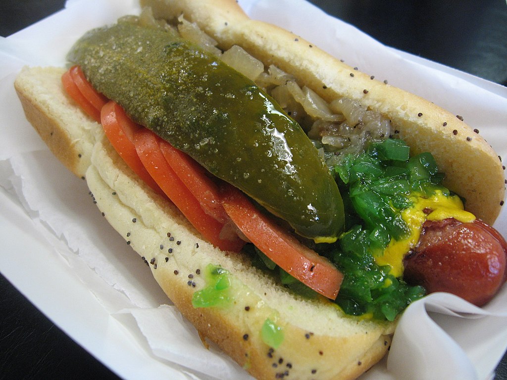
The relish might be radioactive fallout. But still.
1. Chicago-Style - One of the most iconic (yet difficult to eat) that there is. Why difficult to eat? Because there is so much damn stuff on it. First of all, if there is no poppy seed bun, then it's not a Chicago Dog. Then, somehow, you find a way to stuff between the buns a pickle, onions, tomato, relish (often of an unnatural glowing green color), hot "sport" peppers, and dash on some celery salt. A Sonora Dog at least used a larger bun to fit in all of its madness, while the Chicago Dog tries to stuff all of this in a somewhat normal-sized bun. You're going to need to open your mouth wide for this... and still expect a mess after. This gets #1 because it's both tasty and super iconic.

Sunday, August 2, 2020

Ed Ranks the 50 State Quarters, Part IV: The Best (and BONUS!)

The final part. The top 8 quarters. These eight states did a good job and produced awesome quarters to represent themselves. Good work, eight states. Others should have followed your example, because you are the cream of the crop.

By now I have already previewed the question of "Why is a ranking of 50 stated divided into four parts, because 50 is not divisible by four?" What number is divisible by four, however, is 56.  Four different rankings of 14 coins = 56 coins. Because in addition to the state coins that ran between 1999 and 2008, 2009 also brought us a final round of six coins - the District of Columbia and United States Territories! Did you forget about that? Yes? No? Maybe?

Anyway! Once we finish the top 8 states, we'll then go into a BONUS ROUND, featuring a ranking of the six US Territory quarters. FUN!

8. Texas
  • Depicted: State outline, the lone star
  • Caption: "The Lone Star State"
  • Year Released: 2004
  • Analysis: A big ol' picture of Texas, taking up most of teh coin, and a lone star. Yeah. This was about the only way Texas could go. This is a very Texas coin, and represents Texas about as well as a coin can be expected to. They didn't need to show a cowboy trying to lasso anything too. The only qualm would be that it didn't need the caption at all. We get it. We all know it's the Lone Star state. I can't hate on having a silhouette of Texas on this coin at all, like I sort of do with other states being lazy with such depictions. Texas ALWAYS puts silhouettes of its state outline on things, ranging from key chains to "Don't mess with Texas" tote bags. Texas loves the shape of its state, and it's probably the most iconic state outline. So if any state gets to throw its outline up, it's Tejas.

7. Nevada
  • Depicted: Mustangs running, mountains, the rising sun, sagebrush
  • Caption: "The Silver State"
  • Year Released: 2006
  • Analysis: There is a bit too much happening here, but overall I think this is a pretty good coin. The wild mustangs obviously have to stay, but at least one of the other elements could have been taken away and it would have been better. Still though, it would have been nifty to rampant gambling and/or legalized prostitution somehow represented. Why else does anyone go to Nevada? Oh right. "The shows." Suuuuure. Anyway, a lot of states threw horses on their coins. Horse-wise, Nevada did it the best. 

6.  Arizona
  • Depicted: The Grand Canyon, with a saguaro cactus in the foreground
  • Caption: "Grand Canyon State"
  • Year Released: 2008
  • Analysis: I would call this coin "full," but not "busy." While a few other states with so much on the reverse are indeed busy, this is all one iconic landscape, rather than a bunch of random elements thrown together. Because of that, it works and looks good. Once more, I'll say that the motto / caption is totally unnecessary and sort of like when a TV show puts a closed caption on someone who is speaking perfectly fine English for idiots who can't understand a slight accent. And by "slight accent," I do not mean Tom Hardy. That mushmouth needs to be close captioned in every film he's in. I'm not sure I've understood a single word that man has ever said. Anyway, nice coin. Thumbs up, Arizona.

5. North Dakota
  • Depicted: American bison, badlands, the sun
  • Caption: None
  • Year Released: 2006
  • Analysis: For your reference, Kansas. THIS is how you make a coin depicting bison. From the side. Grazing. Epic landscape in the background (which I guess Kansas couldn't do because it's flatter than Taylor Swift's ass). Great coin. It's strange to think that the same woman who designed this epic coin also designed the shitty Michigan garbage coin.

4. New Mexico
  • Depicted: State outline (with relief), Zia sun symbol
  • Caption: "Land of Enchantment"
  • Year Released: 2008
  • Analysis: Good coin. The state outline has some texture on it so you can see mountains and rivers on it (done much better than New York did their silly river and canal), and the iconic sun symbol of the Zia people (also on the New Mexico state flag) is there. This is a nice coin. I could have done without the caption / motto, but that's just being nit-picky now. If you're going to have an outline of your state on the coin, it might as well look like this. 

3. Maine
  • Depicted: Pemaquid Point Lighthouse with rays of light, the schooner Victory Chimes (at sea) with some birds flappin' around.
  • Caption: None
  • Year Released: 2003
  • Analysis: HELL YES. Maine knows how to make a coin. Maine knows they are famous for lighthouses, so they put up a damn lighthouse, and added a boat and water in the background because that makes sense and can naturally fit in. No need for an outline of the state. No need to try to work in a state bird, state flower, state insect, state sexual position, or state diet cola as these other stupid states try to do. And the Maine coin, after five years of the coin program running and 23 states, was the FIRST state that didn't insert any caption or motto on their coin. They didn't actually write "Pemaquid Point Lighthouse" or "Victory Chimes" on their coin in tiny letters. Because they didn't need to. Everyone can see it's a damn lighthouse and a boat. Nobody needs a damned caption. If someone is interested enough to figure out which lighthouse or which / what type of boat, they could look it up. Everything about this coin is great. It took 23 damn coins until a state finally "got it right." Would other states learn from that and improve their coins? Eh. For the most part, no. But there are two states whose coins rank higher, so... sort of!

2. Alaska
  • Depicted: A Grizzly bear catching a salmon, waterfall, the North Star
  • Caption: "The Great Land"
  • Year Released: 2008
  • Analysis: Finally! The act of killing depicted on a coin! This is so American it hurts. Take note of this, Washington. If you want to depict a salmon on a coin, this is how you do it. In the mouth of a fierce predator. The waterfall in the background (to show the salmon was going up-river when it got caught, presumably) is unnecessary, but in the end doesn't distract too much from the awesome bear killing. This is a good coin.

1. Nebraska
  • Depicted: Chimney Rock National Historic Site, Conestoga wagon, a blazing hot sun.
  • Caption: "Chimney Rock"
  • Year Released: 2006
  • Analysis: What a GREAT COIN. Nebraska has a sleek, visually appealing coin. My one and only qualm (one that I made often in these rankings) is that it was unnecessary to put the obvious caption for Chimney Rock on it. Otherwise, a fine specimen of a coin. Everything that the Oregon, Louisiana, and Missouri coins don't give me to depict Westward expansion, this coin does. Seeing this coin makes me feel like I'm successfully on my way west, and will cross the state line to make it to Fort Laramie any time now.

~~~~~

Well, I hope you enjoyed that, and agree that Nebraska is #1. At least in terms of state quarters, that is. If you don't agree, I don't care, because I've already moved on with my life and am ready for the BONUS ROUND of ranking the six District of Columbia and United States Territories quarters!

First of all, I'd like to note that I don't hate any of these six. They're all fine. And if they were mixed in with the State quarters, they'd have all been in the top half. But something has to be the worst of the six, and something has to be the best, and thus we have...

6. District of Columbia
  • Depicted: Duke Ellington seated at a grand piano.
  • Caption: "Duke Ellington", "Justice for all"
  • Year Released: 2009
  • Analysis: Props to DC for highlighting Duke Ellington on it. It was a bold move. Unfortunately, as should have been obvious after 50 state quarters, it is really hard to represent a human being in such small format on a coin, especially if you're going to represent him from the knees up. There is just no way you can get that detail in to represent him well. If the words "Duke Ellington" weren't awkwardly written on the piano, nobody would know that this was supposed to be Duke Ellington by looking at it. Seriously. It could be anyone. When looking at it and ignoring the name written next to it, the first idea that comes to my mind is "Orville Redenbacher." My second guess would be "Alex Trebek," but he's Canadian. A good idea, but I'm afraid that the engraver needed a better idea for how to represent this DC native son. Also, DC should have had the balls to put "Taxation without Representation" on its quarter, like it does with its license plates. Though I suppose since this is a federally-issued coin, the federal government put the halt on recognizing that the citizens of DC (and of all six of the lands represented in these coins) are basically second-class citizens with no direct representation in Congress, thus negating the very principle of representative democracy that we rebelled against the British for not being given in the first place. Anyway, I lost my point somewhere here. Duke Ellington. GREAT idea for a DC quarter. But not depicted well by the engraver. 

5. American Samoa
  • Depicted: An ava bowl (a ceremonial bowl used to drink from during important occasions), whisk and staff; with a coconut tree on the shore in the background.
  • Caption: "Samoa Muamua le Atua" ("Samoa, God is first")
  • Year Released: 2009
  • Analysis: I guess if you know what an ava bowl looks like, it looks like an ava bowl. Though I'm not saying it doesn't look like other things, like a drum and/or the coliseum of Rome, for example. The whisk might also be hard for many to interpret, and confused with something like an open torch, a mop, a broom, or a brush. Again, I don't want to sound like a culturally ignorant dick, because their whisks do look like that. It's just hard to depict on a small coin. Everything in the background is solid though. The island shoreline, the coconut trees. Nice. "God is first" is a wee bit aggressively religious. Even the Deep South quarters never went so ambitiously towards a Sunday service. Which is surprising. Guess those missionaries did their job out in the Pacific. 

4. U.S. Virgin Islands
  • Depicted: An outline of the three major islands, a bananaquit bird, yellow cedar, and a palm trees.
  • Caption: "United in Pride and Hope"
  • Year Released: 2009
  • Analysis: I mostly like it, but there are some issues. For one, it looks like one of the trees is growing out of the bird's head. An interesting choice. Using a lowercase font is also strange on a coin, as most use allcaps (though admittedly, Guam and Puerto Rico also chose to go with lowercase fonts. Mississippi (with a faux cursive) and Illinois (with some odd italicization) were the only states to use lowercase in the 50 state quarters, and neither of those ranked high. For some reason, it looks especially odd on the U.S. Virgin Islands quarter. And what's with the weird, jagged triangles poking out from the right of the flowers and bird. What is that? A shoreline? Because it looks like sideways stalactites.

3. Guam
  • Depicted: An outline of the island, a proa boat, and a latte stone.
  • Caption: "Guahan I Tanó ManChamorro" ("Guam, land of the Chamorro")
  • Year Released: 2009
  • Analysis: We  return to the theme of using an outside of the sta...errr... U.S. Federal Territory. Okay, fine. It's obviously something people are going to keep doing. Here, it's fine. I'm a big fan of the proa (a multi-hull outrigger sailboat of the Austronesian peoples) and the latte stone is okay too. By the way white people, "latte" stones have nothing to do with Starbucks, instead they are pillars that served a functional purpose of of holding up buildings atop them. Like when people in Florida put their houses up on stilts because they live in the Hurricane zone, except, you know, in Guam.  Anyway, they haven't been used for that purpose in a long time and are now more like symbols of Guam and the peoples of the Mariana Islands (and you'll see the Northern Mariana Islands also share the latte stone symbol). Anyway, it's an attractive enough coin. I do like boats. And the latte stone depicted here pretty much look like Jesus's cup (of a carpenter) in Indiana Jones and the Last Crusade, which is sweet.

2. Puerto Rico
  • Depicted: A turret at Castillo San Felipe del Morro, a maga flower (Thespesia grandiflora technically, because saying "maga" these days is very painful), the sea, clouds.
  • Caption: "Isla del Encanto" ("Island of enchantment")
  • Year Released: 2009
  • Analysis: Castillo San Felipe del Morro is a UNESCO World Heritage site, and a notable landmark in Puerto Rico. However, it is odd to depict just one turret of a castle, and for a US coin to depict a castle built by the Spanish. I guess the coin is attractive enough though. And anyway, the French built the State of Liberty, and New York still depicted that. A castle is a cool thing to put on a coin, and it works. I always question whether it makes sense to try to portray a colorful flower on a silver quarter, but whatever. I just don't see why we couldn't have put J-Lo's ass on this thing instead. Oh right. Because she's from New York (you know, the place with the French statue). Right. Sorry. And like I noted earlier, the use of lowercase letters, as opposed to allcaps, makes the caption on this coin odd. Still. A castle turret though. Nice. And those tiny, detailed waves of the sea are superb. Best ocean I've ever seen on a coin.
  •  
1. Northern Mariana Islands
  • Depicted: Shoreline with large latte stone and trees, a canoe of the indigenous Remathau ("Carolinian") people, two white fairy terns, and a mwar-mwar (a lei that is worn around the head like a wreath).
  • Caption: None
  • Year Released: 2009
  • Analysis: Finally, one of the U.S. Territories got my memo that it's okay to let the art do the talking, and not put up a caption or catchphrase. The latter stone on this one, when compared to Guam, is HUUUUUGE, which can also be true. While many latte stones are somewhere around the height of a person (or smaller), others are massive, like one surviving stone at the House of Taga (in the Northern Mariana Islands, naturally). The shoreline in this is nice. The canoe is nice. The trees are nice. The subtle lei/mwar-mwar at the bottom is nice. All these things make it a pretty good coin. But especially the lack of a caption.

Wednesday, July 29, 2020

Ed Ranks the 50 State Quarters, Part III: Getting Better

Here we are, Part III of the 50 state quarters, issued between 1999 and 2008. This time we'll take you between #22 and #9. That will leave the top 8 best for the final edition. Which you might think is sort of weird, right? Why divide a list of 50 things into three rankings of 14 states each, and then have a final ranking that only included the top 8 states?  Because there will be... *dunn dunn DUNNN*.... PLOT TWIST! A special BONUS ranking at the end of the next edition! "Of what?" you might ask. I mean you can probably guess, but I'm still not going to say now.

Anyway, for now, enjoy the quarters that are on the borderline of greatness, but don't quite make the cut of the top.

22. Arkansas
  • Depicted: Diamond, rice stalks, trees, and a mallard flying above a lake
  • Caption: None
  • Year Released: 2003
  • Analysis: At least Arkansas doesn't talk down to us with an unnecessary caption, being the first to learn from Maine after it's lead. Yes, Arkansas is famous for diamonds (and even has a diamond shape on it's flag, although the flag is unfortunately really evocative of the Confederate Flag). Why does this diamond seem like it's floating in the air though? Is this a Movellan starship about to land? Also, there is too much happening here. The trees and rice are really unnecessary, I'd say. Is Arkansas even famous for rice? I think of early American rice growth being in South Carolina and places like that. Not Arkansas. Rice-a-Roni isn't the Arkansas treat. At the very least, I can recognize that Arkansas didn't try to stick even more stuff like a razorback on here. Or Bill Clinton getting some sloppy toppy under the White House desk.

21. Florida
  • Depicted: Spanish galleon, palmetto trees on an island, Space Shuttle
  • Caption: "Gateway to Discovery"
  • Year Released: 2004
  • Analysis: Conceptually, a coin with a freakin' awesome SPACE SHUTTLE on it should rank higher. But this coin could have been done better. I always figured that the Space Shuttle and galleon on the coin represented the space shuttle Discovery, as well as the many ships named "Discovery" that were famed in the era of naval exploration. However, the ship is a Spanish galleon and has nothing to do with any of the Discovery ships, and the Space Shuttle is just supposed to be generic. Also, it's a weird depiction of the Space Shuttle. Instead of showing it at one of the more iconic angles, on this coin it's depicted from below and behind, like we're looking at the Space Shuttle's ass. The Space Shuttle is more in a landing position. Only the Space Shuttle didn't always land in Florida. The Space Shuttle certainly always took off at Cape Kennedy in Florida, but the vast majority of the time at the beginning of the Space Shuttle program, it landed at Edwards Air Force Base in California. Towards the end of the program, yeah, it landed in Florida more, I suppose. But Space Shuttle launches are certainly more iconic and famous that Space Shuttle landings, so you'd think they'd show it taking off instead of landing. It's just weird. Show a better depiction of the Space Shuttle!

20. Virginia
  • Depicted: The three ships that settled Jamestown (Susan Constant, Godspeed, Discovery)
  • Caption: "Jamestown, 1607–2007", "Quadricentennial"
  • Year Released: 2000
  • Analysis: The ships that settled Jamestown is a perfectly fine idea for Virginia's state quarter and, quite frankly, it's a nice-looking quarter. My only problem is the 1607–2007 Quadricentennial thing. This coin came out in 2000. Not 2007. Virginia did the exactly same thing with its license plates, celebrating its 400th anniversary almost a decade earlier than their 400th anniversary actually was. Look Virginia. You had permission to celebrate the 400th Anniversary of Jamestown in 2007. Not 2000. That's too early.

19. Georgia
  • Depicted: Peach, live oak sprigs, state outline
  • Caption: "Wisdom, Justice, Moderation"
  • Year Released: 1999
  • Analysis: Like the Pennsylvania coin that came out the same year, Georgia chose to put an outline of its State on the coin. And a peach, because obviously they were going to put a peach on there. What else was Georgia going to put? Chipper Jones? General Sherman setting fire to Atlanta? Jimmy Carter growing some peanuts? No. A big ol' dumb peach is all that Georgia was ever going to be. Does it look like vagina? Ass? You decide!

18. North Carolina
  • Depicted: The Wright Flyer, the first airplane developed by the Wright Brothers
  • Caption: "First Flight"
  • Year Released: 2001
  • Analysis: The Wright brothers flew their plane for the first time in North Carolina, and that's basically the only thing that North Carolina talks about to this day. The Wright brothers aren't even from North Carolina. They just tested a plane there. They're from Ohio (as you'll see later). At least the coin isn't super ugly. It looks fine, and it's clear what's going on. 

17. Missouri
  • Depicted: Gateway Arch, Lewis & Clark (& York) floating down the Missouri River
  • Caption: "Corps of Discovery 1804–2004"
  • Year Released: 2003
  • Analysis: Like Virginia, Missouri celebrated it's anniversary a bit early, but can be forgiven for being one year off rather than jumping ahead seven years to pretend that 2000 and 2007 are the same thing. So no fault there. The trees on this coin look stupid, though the concept is fine. The Gateway Arch in the middle dividing it. People on the boat. It's okay, but could have been executed a little better. All in memory of the glorious expedition that handed out peace medals to Native Americans who we would later betray and steal their land. HORRAY?

16. Pennsylvania
  • Depicted: Commonwealth statue, state outline, keystone
  • Caption: "Virtue, Liberty, Independence"
  • Year Released: 1999
  • Analysis: A female gilded statue, adorned in Greek robes, atop the dome of the Pennsylvania State Capitol building is the highlight of this coin. Though for some reason, Pennsylvania tried to jam in as much stuff as possible, including an outline of their state in case you forgot what it looked like, and the symbol of a keystone in case you forgot that they were the "Keystone" state. In theory, that should make the coin too busy, but it really doesn't. This very early coin sort of works. Unfortunately, it would inspire all the other states who came after to rely on the "let's use an outline of our state as a crutch if we can't think of anything else!"  Speaking of which...

15. South Carolina
  • Depicted: Carolina wren, yellow jessamine flower, palmetto tree, state outline
  • Caption: "The Palmetto State"
  • Year Released: 2000
  • Analysis: Even though the 50 State Quarter program was only a year old, South Carolina was the fourth out of then eight states to put the outline of their state on their coin. So not an original idea, and SC also decided to throw a bunch of their official state symbols on the coin (their tree, their flower, their bird). Too much? In theory, yes. Just like Pennsylvania, one would think they're throwing too much on here. I don't know, though. For some reason it works. Maybe they could have just stayed with the state outline and palmetto tree without the bird and all that. But I don't hate it. It's balanced. It's not too busy. It's an okay coin.

14. Minnesota
  • Depicted: Common loon and fishermen in a boat (both on a lake), and the state outline
  • Caption: "Land of 10,000 Lakes"
  • Year Released: 2005
  • Analysis: Hrm. This one isn't awful. The Loon bird. Lakes. I suppose it's okay. Maybe even wortht of 14th place. The outline of the state is sort of weirdly small and on the side. I dunno. I feel like this could have been executed a little better, but overall it's fine. Lakes. Loons. Yeah. Only adding the Land O Lakes butter woman would make it more Minnesota. Although I guess she's gone now too... just like a slave-owning Delaware horseman. 

13. Wisconsin
  • Depicted: Head of a cow, round of cheese, and ear of corn
  • Caption: "Forward"
  • Year Released: 2004
  • Analysis: Even though Iowa's coin came out two months before Wisconsin's in 2004, somehow Wisconsin was able to get the one up on them and steal their corn away. Yes. Wisconsin is obviously famous for dairy. I would have personally gone for an entire cow instead of a cow's head, but I get it. Major points for the block of cheese though. Other states would be too good to show something like a block of cheese on it, but Wisconsin is like, "Fuck it, we wear this on our heads during football games, so we might as well throw it on a quarter." I have to respect that. There is no reason for the "Forward" though. What the hell does that even mean? Is it a suggestion? A command? Driving directions? Make it a full cow and replace the corn with Bart Starr and this would have been the greatest quarter of all time.

12. Oregon
  • Depicted: Crater Lake National Park
  • Caption: "Crater Lake"
  • Year Released: 2005
  • Analysis: It's visually attractive, but I have no memory of this coin at all. Back in the day I collected these things, and I remember the good ones and bad ones alike. This one? Nothing. It's not stirring up any sort of memory. And why is this coin not dedicated to the Oregon Trail? That's the only thing anyone cares about Oregon. Getting to the damn Willamette Valley with a score higher that Stephen Meek. And to do that, you need to make sure your party is all alive, well-equipped, and that you're playing as a farmer to get that extra point bonus. Oxen, wagon parts and spare clothes are all worth a lot too. Forget bullets, food and cash. Anyway, my point is "pretty, but forgettable."

11. Montana
  • Depicted: Bison skull, mountains, the Missouri River
  • Caption: "Big Sky Country"
  • Year Released: 2007
  • Analysis: First of all, major props for having the courage to put a dead animal skull on your coin. That's sort of bad-ass. Although having the skull float in the middle of the air over the mountains when the text says "Big Sky Country" seems to imply that, instead of having a sun, there is a massive bison skull floating in the sky of Montana. Which honestly wouldn't surprise me.

10. Rhode Island
  • Depicted: America's Cup yacht Reliance on Narragansett Bay, Claiborne Pell Newport Bridge
  • Caption: "The Ocean State"
  • Year Released: 2001
  • Analysis: "The Ocean State"is a dumb nickname for the US's tiniest state. And how much whiter can you get an an America's Cup yacht? That's about the whitest thing you can put on a coin. Is it pretty though? Sure. It's a pretty enough looking coin. Boats are cool.You throw a boat on the coin, and I'll rank it high. So long as the boat isn't that ugly. So really, this statement means nothing though. Good work on hitting the Top 10 though, RI.

9. Ohio
  • Depicted: Wright Flyer, astronaut (Neil Armstrong/John Glenn?), state outline
  • Caption: "Birthplace of Aviation Pioneers"
  • Year Released: 2002
  • Analysis: One year after North Carolina, Ohio put the exact same thing (the Wright Flyer) on their coin that North Carolina already did. Why? The Wright brothers were from Dayton. Depending on who the astronaut is supposed to be - either Neil Armstrong, a native of Wapakoneta, or John Glenn, who went on to become a Senator for Ohio - this coin also represents a different Ohio spaceman. It's probably Armstrong though. Do I hate this coin for being a repeat of aspects from the previous NC coin though? NOPE! This coin has a COOL-ASS ASTRONAUT ON IT! HELL YEAH! AMERICA OWNS THE MOON, PEOPLE! By the time Ohio's coin came out in 2002, doing generic state outlines and the Wright brothers plane was already played out and old hat. But somehow, Ohio makes it still work. 
Next time, we finish this all off with the top 8 state quarters and the special bonus round. Until then.

Saturday, July 25, 2020

Ed Ranks the 50 State Quarters, Part II: The Okay

I resume my ranking of the 50 state quarters, produced at five a year, for ten years, between 1999 and 2008. We now entire the realm of the "just okay" coins. They aren't the worst, and as we go along, they start to get "better."  In fact we'll end here at around #23, which means we're dipping a little bit into the top half. Still, nothing to be too proud of.

Enjoy the quarters! Or don't! I really can't force you to feel one way or the other. 

36. New York
  • Depicted: Statue of Liberty, 11 stars, state outline with line tracing Hudson River and Erie Canal
  • Caption: "Gateway to Freedom"
  • Year Released: 2001
  • Analysis: The Statue of Liberty and an outline of New York was all this coin needed, and everything else is too much. An outline of the Erie Canal? A waterway that hasn't been relevant since trains became a thing? Who cares? Also, like with New Hampshire, it decided that it needed to put a number of stars on the coin to depict which state it was to join the union (11th). Again, nobody cares.

35. Tennessee
  • Depicted: Fiddle, trumpet, guitar, musical score, three stars
  • Caption: "Musical Heritage"
  • Year Released: 2002
  • Analysis:Tennessee is acting like they invented all music with this coin. Whatever. Grand Ol' Opry. Elvis. Yeah, I guess you're somewhat associated with music. There are a lot of states in the south that could have a fiddle on it though. It's the universal musical instrument of rednecks.

34. Indiana
  • Depicted: IndyCar, state outline, 19 stars
  • Caption: "Crossroads of America"
  • Year Released: 2002
  • Analysis: I guess the Indianapolis 500 is the only thing this state has (other than the Terre Haute Federal prison's death chamber, which I can't imagine being put on a coin even though it would be AWESOME). What else was it going to put there? But let's be serious. Is Indiana really the crossroads of America? And isn't it dangerous for an IndyCar to be on the crossroads? Those things go way too fast for intersections.

33. Alabama
  • Depicted: Helen Keller, a longleaf pine, branch, magnolia blossoms
  • Caption: "Spirit of Courage", "Helen Keller" (in English and Braille)
  • Year Released: 2003
  • Analysis: Surprisingly, Helen Keller (despite being blind, deaf and mute) is actually still the most educated, well-spoken and literate person to ever come out of Alabama. Just watch and Alabama politician or listen to a Lyndyrd Skynyrd song and you'll know that's true. Also, Magnolias just like the Mississippi coin. I mean you get props to attempting to display a notably Alabaman that people actually like, and for putting braille on a coin, but honestly all I can think of now is Patty Duke screaming "Waaa waaa" in The Miracle Worker. The 1962 version, of course. She was Annie Sullivan in the 79 TV Movie version which had no reason to exist or ever be made. Seriously though, putting Braille on a coin is probably the most progressive thin that Alabama has ever done. I figured Alabama's coin would probably just be a burning cross.

32. Idaho
  • Depicted: Peregrine falcon, state outline with star indicating location of Boise
  • Caption: "Esto Perpetua" ("Let it Be Forever")
  • Year Released: 2007
  • Analysis: I'm not digging this one. I like hawks, but why is this, like, a bust of a hawk's top half, rather than an entire hawk in the air? Are busts of birds a big thing? I also don't think of hawks when I think of Idaho. I think of potatoes. Wisconsin at least had the courage and self-acceptance to recognize that it should have a big wheel of cheese on it (you'll see later), yet Idaho won't own up to only being famous for potatoes... and white supremacist Californians who retire there because there are "too many brown people" moving in? When I think of a hawk on a coin, I think that coin should belong to some sort of cool Middle Eastern country famous for falconry and Bedouins. Also, it looks like the giant hawk is about to eat the tiny Idaho on the coin. And why is Boise shown with a star? No other state that did an outline of it was like "and here is our capital!" This isn't a high school quiz. The bird looks cool, but it doesn't scream "Idaho" to me at all.

31. Kentucky
  • Depicted: Thoroughbred racehorse behind fence, Bardstown Mansion, Federal Hill
  • Caption: "My Old Kentucky Home"
  • Year Released: 2001
  • Analysis: Obviously Kentucky was going to depict a racehorse since it doesn't have the balls to display a jug of bourbon. This is an okay coin, but I'm not digging the mansion. It's too much. A horse on a farm would have been enough.I don't need the mansion. Or better yet, a depiction of a horse race, with two horses neck-and-neck. Seriously though... bourbon. That would be nice.

30. Hawaii
  • Depicted: Statue of Kamehameha I with state outline
  • Caption: "Ua Mau ke Ea o ka ʻĀina i ka Pono" ("The life of the land is perpetuated in righteousness")
  • Year Released: 2008
  • Analysis: The final state, and the last of the state coins, belongs to Hawaii. As I implied when discussing why Oklahoma's coin failed, it was wise for Hawaii not to do a rainbow because that simply wont work on a coin. That being said, there were many better options to go with other than a depiction of a STATUE of Kamehameha. For example, why not try to actually directly depict Kamehameha instead of depicting a statue of him. There could have been dozens of other choices though. Beaches with palm trees. Plumeria flowers. Yellow Hibiscus flowers. Diamond Head State Monument (maybe in  the background, with a beach in the foreground). Some other notable volcano. Hula dancers with leis. Pineapples. Someone surfing (Duke Kahanamoku or Eddie Aikau, preferably. Bethany Hamilton getting her arm eaten off by a shark would probably be a bad choice). An outrigger, Hōkūleʻa, or other traditional Polynesian sailing vessel. Israel Kamakawiwoʻole playing a ukulele wouldn't have been a bad choice either.  Hawaii's coin isn't terrible, but it could have been much better (as later US Territories quarters from other Polynesian places like Guam, American Samoa, and the Northern Mariana Islands would prove).

29. Utah
  • Depicted: "Golden" spike, Locomotives Jupiter, No. 119, and the completion of the Transcontinental Railroad
  • Caption: "Crossroads of the West"
  • Year Released: X
  • Analysis: Why does every state want to be "The Crossroads?" New Jersey was "Crossroads of the Revolution." Indiana was ""Crossroads of America." Now we have the "Crossroads of the West." Yes, the Transcontinental Railroad was indeed completed here, and the spike was put in the ground (which, of course, you can't tell is golden on this silver coin). It's like someone watched the film Wild, Wild West and thought it would be cool to have the golden spike ceremony depicted on this coin too. I dunno. Trains are cool, but this coin could have looked a lot more visually appealing.

28. Colorado
  • Depicted: Longs Peak
  • Caption: "Colorful Colorado"
  • Year Released: 2006
  • Analysis: Nothing like a silver monotone depiction of a boring mountainside (which would just be gray and brown anyway) being described as "colorful." It's not an ugly coin overall, but it's a little "blah." And it is not, at all, colorful. Again. Follow the "Oklahoma rule" and don't try to depict something colorful on a monotone palette. Also, this Longs Peak is so generic looking it could be a fictional rock formation.

27. New Jersey
  • Depicted: Washington Crossing the Delaware
  • Caption: "Crossroads of the Revolution"
  • Year Released: 1999
  • Analysis: It's a little odd that New Jersey chose Washington crossing the Delaware River as its choice, considering that the name of ANOTHER STATE is more prominent in the theme, and the crossing of the Delaware River also involves another state, Pennsylvania, from which Washington's plan was actually launched. In fairness though, yes, this Christmas-night surprise attack led to a victory against Hessian forces at the Battle of Trenton (in New Jersey) on the morning of December 26, so... yeah... New Jersey. Still though, this is mainly based on a depiction of the crossing from a famous painting, and there is just too much damn small, minute detail that doesn't really work on a small coin. If you look at it closely, you have to actually know and recognize the painting to be able to tell that this coin represents that event, because otherwise what's on the coin is just sort of blotchy and un-detailed. An ambitious choice that doesn't totally work. 

26. California
  • Depicted: John Muir, California condor, Half Dome
  • Caption: "John Muir," "Yosemite Valley"
  • Year Released: 2005
  • Analysis: Look, I'm an environmentally aware and considerate person who even took an environmental science course in college. I respect the decision to put John Muir on a coin. I even dedicated a weekend back in the day volunteering to do phone calls for the Sierra Club. Still though, California has so many options for what they could have put on their coin that I'm sort of disappointed that an old main staring at a rock is what they went with. And neither John Muir, nor the Half Dome (a feature in Yosemite National Park) are famous enough so that they can survive on their own, so this time the captions are absolutely needed so that people aren't asking "What the hell are these things?"  I'm not saying that California's coin should have been the Golden Gate Bridge, the Hollywood Sign, or Grauman's Chinese Theater. If they picked something from one specific California city rather than another, I could see how people from the other cities would be pissed. But even if going for some nice environmental scene, they could have picked some better choices. How about the redwoods? It might be hard to pull off that on a small coin, but it could be done. Even in Yosemite, the El Capitan cliff is more iconic than Half Dome (I'd argue) and could have been depicted instead. In fact, it WAS depicted later (in 2010) when they issued the America the Beautiful quarters based on National Parks. California blew this one like a struggling actress on a casting couch. Which, honestly, also could have been depicted on the coin as a more accurate representation of the state.
25. Wyoming
  • Depicted: Bucking Horse and Rider
  • Caption: "The Equality State"
  • Year Released: 2007
  • Analysis: Wyoming is definitely the Equality State. Unless you're a woman. Or Black. Or Hispanic. Or anything other than a white, conservative male. But other than that, totally the Equality State. Also, this coin is trying too hard to be like "Yeah, we're cowboys!" Texas avoided such an obvious depiction, but Wyoming couldn't resist it. It doesn't even look like a proper depiction of a cowboy that someone put a lot of work into. It looks like a silhouette of a cowboy that would appear in neon on the side of a saloon and/or strip club called "Annie Oakley's Roadhouse." I appreciate the simplicity and the concept, but this is a straight up middle-of-the-road state coin.

24. Kansas
  • Depicted:  Bison, sunflowers
  • Caption: None
  • Year Released: 2005
  • Analysis: A bison is a damn fine thing to put on a coin, such as the iconic "Buffalo nickel." However, this bison is at an odd angle. And the sunflower isn't totally needed. Still, Kansas at least had the common sense to know that their depiction was straight forward and didn't need a caption like "American Bison." People in Texas are like "Durrr, what is this? Oh yeah! The Lone Star State... because it says so!" Kansas kept it simple, but the design of the bison could have been a bit sleeker. And without those weird legs that vanish into the grass and therefore look like odd chicken drumsticks. Or perhaps... buffalo wings? *rimshot?* Seriously though, Clark Kent should have been on the Kansas coin. Everyone knows that.

23. Washington
  • Depicted: Salmon leaping in front of Mount Rainier
  • Caption: "The Evergreen State"
  • Year Released: 2007
  • Analysis: The salmon is cool, but the depiction of Mount Rainier could have been done a little better. I know it's hard to depict a snow-capped mountain on a one-color coin, but this coin especially doesn't do a good job. Not a terrible coin, but not a great one either. That's why it's here in the middle at #23. Also, the little "sploosh" of water under the fish doesn't look right either on a small coin. 

That's it for now. Next time we get to coins that are finally good ones and maybe I'll stop making fun of them so much. I hope that makes you feel better, in case you were feeling bad for the quarters.