Here we are, Part III of the 50 state quarters, issued between 1999 and 2008. This time we'll take you between #22 and #9. That will leave the top 8 best for the final edition. Which you might think is sort of weird, right? Why divide a list of 50 things into three rankings of 14 states each, and then have a final ranking that only included the top 8 states? Because there will be... *dunn dunn DUNNN*.... PLOT TWIST! A special BONUS ranking at the end of the next edition! "Of what?" you might ask. I mean you can probably guess, but I'm still not going to say now.
Anyway, for now, enjoy the quarters that are on the borderline of greatness, but don't quite make the cut of the top.
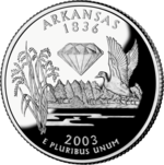
22. Arkansas
21. Florida

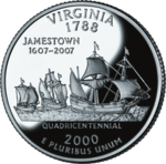
20. Virginia
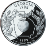
19. Georgia
18. North Carolina
17. Missouri

16. Pennsylvania

15. South Carolina

14. Minnesota

13. Wisconsin

12. Oregon

11. Montana

10. Rhode Island

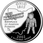
9. Ohio
Anyway, for now, enjoy the quarters that are on the borderline of greatness, but don't quite make the cut of the top.
22. Arkansas
- Depicted: Diamond, rice stalks, trees, and a mallard flying above a lake
- Caption: None
- Year Released: 2003
- Analysis: At least Arkansas doesn't talk down to us with an unnecessary caption, being the first to learn from Maine after it's lead. Yes, Arkansas is famous for diamonds (and even has a diamond shape on it's flag, although the flag is unfortunately really evocative of the Confederate Flag). Why does this diamond seem like it's floating in the air though? Is this a Movellan starship about to land? Also, there is too much happening here. The trees and rice are really unnecessary, I'd say. Is Arkansas even famous for rice? I think of early American rice growth being in South Carolina and places like that. Not Arkansas. Rice-a-Roni isn't the Arkansas treat. At the very least, I can recognize that Arkansas didn't try to stick even more stuff like a razorback on here. Or Bill Clinton getting some sloppy toppy under the White House desk.
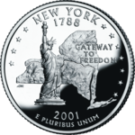
21. Florida
- Depicted: Spanish galleon, palmetto trees on an island, Space Shuttle
- Caption: "Gateway to Discovery"
- Year Released: 2004
- Analysis: Conceptually, a coin with a freakin' awesome SPACE SHUTTLE on it should rank higher. But this coin could have been done better. I always figured that the Space Shuttle and galleon on the coin represented the space shuttle Discovery, as well as the many ships named "Discovery" that were famed in the era of naval exploration. However, the ship is a Spanish galleon and has nothing to do with any of the Discovery ships, and the Space Shuttle is just supposed to be generic. Also, it's a weird depiction of the Space Shuttle. Instead of showing it at one of the more iconic angles, on this coin it's depicted from below and behind, like we're looking at the Space Shuttle's ass. The Space Shuttle is more in a landing position. Only the Space Shuttle didn't always land in Florida. The Space Shuttle certainly always took off at Cape Kennedy in Florida, but the vast majority of the time at the beginning of the Space Shuttle program, it landed at Edwards Air Force Base in California. Towards the end of the program, yeah, it landed in Florida more, I suppose. But Space Shuttle launches are certainly more iconic and famous that Space Shuttle landings, so you'd think they'd show it taking off instead of landing. It's just weird. Show a better depiction of the Space Shuttle!
20. Virginia
- Depicted: The three ships that settled Jamestown (Susan Constant, Godspeed, Discovery)
- Caption: "Jamestown, 1607–2007", "Quadricentennial"
- Year Released: 2000
- Analysis: The ships that settled Jamestown is a perfectly fine idea for Virginia's state quarter and, quite frankly, it's a nice-looking quarter. My only problem is the 1607–2007 Quadricentennial thing. This coin came out in 2000. Not 2007. Virginia did the exactly same thing with its license plates, celebrating its 400th anniversary almost a decade earlier than their 400th anniversary actually was. Look Virginia. You had permission to celebrate the 400th Anniversary of Jamestown in 2007. Not 2000. That's too early.
19. Georgia
- Depicted: Peach, live oak sprigs, state outline
- Caption: "Wisdom, Justice, Moderation"
- Year Released: 1999
- Analysis: Like the Pennsylvania coin that came out the same year, Georgia chose to put an outline of its State on the coin. And a peach, because obviously they were going to put a peach on there. What else was Georgia going to put? Chipper Jones? General Sherman setting fire to Atlanta? Jimmy Carter growing some peanuts? No. A big ol' dumb peach is all that Georgia was ever going to be. Does it look like vagina? Ass? You decide!
18. North Carolina
 Depicted: The Wright Flyer, the first airplane developed by the Wright Brothers
- Caption: "First Flight"
- Year Released: 2001
- Analysis: The Wright brothers flew their plane for the first time in North Carolina, and that's basically the only thing that North Carolina talks about to this day. The Wright brothers aren't even from North Carolina. They just tested a plane there. They're from Ohio (as you'll see later). At least the coin isn't super ugly. It looks fine, and it's clear what's going on.
17. Missouri
- Depicted: Gateway Arch, Lewis & Clark (& York) floating down the Missouri River
- Caption: "Corps of Discovery 1804–2004"
- Year Released: 2003
- Analysis: Like Virginia, Missouri celebrated it's anniversary a bit early, but can be forgiven for being one year off rather than jumping ahead seven years to pretend that 2000 and 2007 are the same thing. So no fault there. The trees on this coin look stupid, though the concept is fine. The Gateway Arch in the middle dividing it. People on the boat. It's okay, but could have been executed a little better. All in memory of the glorious expedition that handed out peace medals to Native Americans who we would later betray and steal their land. HORRAY?
16. Pennsylvania
- Depicted: Commonwealth statue, state outline, keystone
- Caption: "Virtue, Liberty, Independence"
- Year Released: 1999
- Analysis: A female gilded statue, adorned in Greek robes, atop the dome of the Pennsylvania State Capitol building is the highlight of this coin. Though for some reason, Pennsylvania tried to jam in as much stuff as possible, including an outline of their state in case you forgot what it looked like, and the symbol of a keystone in case you forgot that they were the "Keystone" state. In theory, that should make the coin too busy, but it really doesn't. This very early coin sort of works. Unfortunately, it would inspire all the other states who came after to rely on the "let's use an outline of our state as a crutch if we can't think of anything else!" Speaking of which...
15. South Carolina
- Depicted: Carolina wren, yellow jessamine flower, palmetto tree, state outline
- Caption: "The Palmetto State"
- Year Released: 2000
- Analysis: Even though the 50 State Quarter program was only a year old, South Carolina was the fourth out of then eight states to put the outline of their state on their coin. So not an original idea, and SC also decided to throw a bunch of their official state symbols on the coin (their tree, their flower, their bird). Too much? In theory, yes. Just like Pennsylvania, one would think they're throwing too much on here. I don't know, though. For some reason it works. Maybe they could have just stayed with the state outline and palmetto tree without the bird and all that. But I don't hate it. It's balanced. It's not too busy. It's an okay coin.
14. Minnesota
- Depicted: Common loon and fishermen in a boat (both on a lake), and the state outline
- Caption: "Land of 10,000 Lakes"
- Year Released: 2005
- Analysis: Hrm. This one isn't awful. The Loon bird. Lakes. I suppose it's okay. Maybe even wortht of 14th place. The outline of the state is sort of weirdly small and on the side. I dunno. I feel like this could have been executed a little better, but overall it's fine. Lakes. Loons. Yeah. Only adding the Land O Lakes butter woman would make it more Minnesota. Although I guess she's gone now too... just like a slave-owning Delaware horseman.
13. Wisconsin
- Depicted: Head of a cow, round of cheese, and ear of corn
- Caption: "Forward"
- Year Released: 2004
- Analysis: Even though Iowa's coin came out two months before Wisconsin's in 2004, somehow Wisconsin was able to get the one up on them and steal their corn away. Yes. Wisconsin is obviously famous for dairy. I would have personally gone for an entire cow instead of a cow's head, but I get it. Major points for the block of cheese though. Other states would be too good to show something like a block of cheese on it, but Wisconsin is like, "Fuck it, we wear this on our heads during football games, so we might as well throw it on a quarter." I have to respect that. There is no reason for the "Forward" though. What the hell does that even mean? Is it a suggestion? A command? Driving directions? Make it a full cow and replace the corn with Bart Starr and this would have been the greatest quarter of all time.
12. Oregon
- Depicted: Crater Lake National Park
- Caption: "Crater Lake"
- Year Released: 2005
- Analysis: It's visually attractive, but I have no memory of this coin at all. Back in the day I collected these things, and I remember the good ones and bad ones alike. This one? Nothing. It's not stirring up any sort of memory. And why is this coin not dedicated to the Oregon Trail? That's the only thing anyone cares about Oregon. Getting to the damn Willamette Valley with a score higher that Stephen Meek. And to do that, you need to make sure your party is all alive, well-equipped, and that you're playing as a farmer to get that extra point bonus. Oxen, wagon parts and spare clothes are all worth a lot too. Forget bullets, food and cash. Anyway, my point is "pretty, but forgettable."
11. Montana
- Depicted: Bison skull, mountains, the Missouri River
- Caption: "Big Sky Country"
- Year Released: 2007
- Analysis: First of all, major props for having the courage to put a dead animal skull on your coin. That's sort of bad-ass. Although having the skull float in the middle of the air over the mountains when the text says "Big Sky Country" seems to imply that, instead of having a sun, there is a massive bison skull floating in the sky of Montana. Which honestly wouldn't surprise me.
10. Rhode Island
- Depicted: America's Cup yacht Reliance on Narragansett Bay, Claiborne Pell Newport Bridge
- Caption: "The Ocean State"
- Year Released: 2001
- Analysis: "The Ocean State"is a dumb nickname for the US's tiniest state. And how much whiter can you get an an America's Cup yacht? That's about the whitest thing you can put on a coin. Is it pretty though? Sure. It's a pretty enough looking coin. Boats are cool.You throw a boat on the coin, and I'll rank it high. So long as the boat isn't that ugly. So really, this statement means nothing though. Good work on hitting the Top 10 though, RI.
9. Ohio
- Depicted: Wright Flyer, astronaut (Neil Armstrong/John Glenn?), state outline
- Caption: "Birthplace of Aviation Pioneers"
- Year Released: 2002
- Analysis: One year after North Carolina, Ohio put the exact same thing (the Wright Flyer) on their coin that North Carolina already did. Why? The Wright brothers were from Dayton. Depending on who the astronaut is supposed to be - either Neil Armstrong, a native of Wapakoneta, or John Glenn, who went on to become a Senator for Ohio - this coin also represents a different Ohio spaceman. It's probably Armstrong though. Do I hate this coin for being a repeat of aspects from the previous NC coin though? NOPE! This coin has a COOL-ASS ASTRONAUT ON IT! HELL YEAH! AMERICA OWNS THE MOON, PEOPLE! By the time Ohio's coin came out in 2002, doing generic state outlines and the Wright brothers plane was already played out and old hat. But somehow, Ohio makes it still work.


_-_Blue_Cypress_Lake%2C_Florida.jpg/220px-Red-shouldered_Hawk_(Buteo_lineatus)_-_Blue_Cypress_Lake%2C_Florida.jpg)
