When ranking the counties of New Hampshire last time, I recalled the story of the Old Man of the Mountain, a dumb thing that appeared on NH's state coin in 2000 and then summarily collapsed to the ground in 2003. That made me think back fondly of the time that I ranked the state quarters. Then I thought to myself... "Hey, wait a minute! Did I actually rank the state quarters? I'm pretty sure I did, right?" Well, I looked into the archives, and I apparently did not. Oh, I've ranked the states before. And I've ranked coins too. Euro coins. Circulating US coins. And so I've mentioned the state quarters before, but I haven't actually ranked them.
This needs to be remedied, now.
Since there are 50 of them, I'm dividing this into multiple parts. How many? Four! Which is a weird number, because 50 isn't divisible by 4. I mean it is. But not as a whole number. Whatever. By the time we get to the end of this whole thing, it will all be fine. Anyway, here are he 14 worst coins, ranking between #50 and #37.
50. South Dakota

49. Illinois

47. New Hampshire

46. Michigan

45. Louisiana
44. Oklahoma

43. West Virginia

42. Mississippi

41. Maryland

40. Delaware

39. Massachusetts

38. Iowa

37. Vermont
That's it for now. Next time, we go to coins that are "just okay" instead of the worst. I hope you're waiting with gleeful anticipation.
This needs to be remedied, now.
Since there are 50 of them, I'm dividing this into multiple parts. How many? Four! Which is a weird number, because 50 isn't divisible by 4. I mean it is. But not as a whole number. Whatever. By the time we get to the end of this whole thing, it will all be fine. Anyway, here are he 14 worst coins, ranking between #50 and #37.
50. South Dakota
- Depicted: Mount Rushmore, ring-necked pheasant, wheat
- Caption: None
- Year Released: 2006
- Analysis: South Dakota really had no choice other than Mount Rushmore for their coin, because there is literally nothing else to do in South Dakota. This is the only thing it is famous for. Even then, slamming four faces onto one coin (including a face which is already on the other side of the coin) is a bit much, and leads to a sloppy / poorly detailed representation. And why the hell is this pheasant flying? Did the person who make this coin know anything about pheasants at all? Yes, they obviously can fly. Short distances. But pheasants are famous for being ground birds. Showing one flying on a coin is dumb. It's not their natural habitat. Why not show George Washington scuba diving on a coin? Because he isn't famous for scuba diving. Nor are pheasants famous for flying. In fact, they are specifically famous for NOT flying. And when they do, they flap their wings wildly to go a short distance to get the hell away from a hunter (most likely) or other predator. They don't have their wings beautifully spread out like their gliding magestically. It was like the person who designed this coin was forced to add a pheasant, but the only empty space on the coin was in the air above Mt. Rushmore, so he just put the bird in the air for no reason. Bad coin. Worst coin! I hate this coin so much. Mainly because the stupid pheasant.
49. Illinois
- Depicted: "Young" Abraham Lincoln, a farm scene, Chicago skyline with the Sears Tower, an outline of the state, and 21 stars (11 on left, 10 on right, depicting the
- Caption: "Land of Lincoln", "21st state/century"
- Year Released: 2003
- Analysis: Waaaaaay too much going on with this coin. Of course there is Lincoln, which is fine. But why (allegedly) young Lincoln instead of bearded President Lincoln? According to official US Mint sources, it's supposed to represent "how Abraham Lincoln must have looked forward to his new career in law from his job as a young rail-splitter." Seriously though... what? Abe Lincoln isn't famous because he was a rail-splitter or lawyer. It was because he became PRESIDENT and won the Civil War. And even then, Illinois didn't commit all the way to "young" Lincoln, because they still give him a sort of old face to make him look more Lincoln-like. The official sources also always note specifically that there are 11 stars on the left and 10 on the right instead of simply saying "21 stars." Why the 11-10 breakdown? I have been unable to find any specific explanation of why the US Mint always says "11 on the left, 10 on the right" instead of just saying "21." At first you might think it has something to do with a divided Union and the Civil War, but it doesn't because there were 34 states by the time of the Civil War, not 21. And yes, it is the 21st state. And yes, 2003 was near the beginning of the 21st Century. I suppose that minor coincidence was important enough to note on the coin like it was somehow important. "OH! We were the 21st State, and now it's the 21st Century! How fortuitous! The symbolism!" Eat a dick. This coin is a HOT. FUCKING. MESS. Add to all that other disasters like the silhouette of a farm and the skyline of Chicago as some sort of hacky "we are both rural AND urban" message. Lame. Plus the Sears Tower had already been demoted to SECOND tallest building in the world by the time this coin came out (the Petronas Towers in Malaysia surpassed it in 1998, and by the next year in 2004 Sears would drop to #3 after Taipei 101 was completed). All and all, a garbage coin. One of the worst. I'm angry at how bad this coin is.
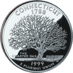
- Depicted: The Charter Oak, a tree in the state.
- Caption: "The Charter Oak"
- Year Released: 1999
- Analysis: The last of the original five 1999 coins, representing the first five states to join the United States via ratifying the Constitution, was Connecticut. They put a dumb, old oak tree on it. With no leaves. This coin is lame. This is about as bad as a coin can get. They only chose it because the tree is sort of round from the one angle and coins are round, so they thought it would fit. At least I assume. You have a big tree. Whoop-dee-doo.
47. New Hampshire
- Depicted: Old Man of the Mountain, nine stars
- Caption: "Old Man of the Mountain", "Live Free or Die"
- Year Released: 2000
- Analysis: Speaking of bad coins, this was the bad coin that reminded me to do this ranking. It is a very stupid coin. The Old Man of the Mountain doesn't look that much like a face, and it was never that famous (nor geologically stable, apparently). I'm not sure what could have gone on this coin instead, but New Hamsphire could have done something else.Maybe the boat from the State Seal. A covered bridge? I dunno. I'm not being paid to think of what should go on a coin. Someone else, however, was. And this was the best garbage they could come up with.
46. Michigan
- Depicted: State outline, outline of the Great Lakes
- Caption: "Great Lakes State"
- Year Released: 2004
- Analysis: This is the textbook definition of a poorly designed state quarter. It's dumb and looks ugly. It tries to focus both on the state itself (filled in) and the Great Lakes (hollow, and including Lake Erie - which has no phsyical contact with the State of Michigan at all). In the end, the outline of the lakes (as depicted here) looks like a horn-nosed, angry horse with a penis that took two large dumps on the ground behind it. Seriously. It looks like that. Don't you see it? The state itself is almost an afterthought. And there is no need to write "Great Lakes State" on the coin. We get it. This is, simply put, a poorly thought-out coin design.
45. Louisiana
- Depicted: Brown pelican; trumpet with musical notes, outline of Louisiana Purchase on map of US
- Caption: "Louisiana Purchase"
- Year Released: 2002
- Analysis: Another train-wreck of a design that focuses more on territory that isn't even part of the state it's supposed to represent. Louisiana is an awesome state, and its coin should have just been Louis Armstrong blowing a trumpet. Maybe a pelican is okay too. But the Louisiana Purchase, highlighting territory that has not actually been part of "Louisiana" for well over two centuries... that's just dumb. I expected better of this state. This coin is not that appealing at all. Stick to the boot of Lousiana and leave the rest of the Midwest out of this.

44. Oklahoma
- Depicted: Scissor-tailed flycatcher and firewheel (Gaillardia pulchella, aka "Indian Blanket") flower
- Caption: None
- Year Released: 2008
- Analysis: The Scissor-tailed flycatcher is an ugly bird (or at least depicted as ugly on this coin), and the brightly-colored firewheel flower (which is visually appealing in person) totally goes to waste on a silver coin without vibrant color. Hawaii didn't try to depict a rainbow on its coin. Why? Because rainbows are literally multiple colors, and coins are silver. That was smart. Trying to depict a colorful flower on a monochromatic coin is a bad idea. Really, anything sort of depicting farmland or a vague sence of "the West" would have been a better choice for Oklahoma. A barn. A windmill. Bison (again, there are a lot of states that already had bison before 2008). An open field with a rancher. An outline of the state itself. Or even a scene from the Rodgers and Hammerstein musical. All those things would have been better than this nonsense.
43. West Virginia
- Depicted: New River Gorge Bridge
- Caption: "New River Gorge"
- Year Released: 2005
- Analysis: There is absolutely nothing to do in West Virginia except for meth and your family members, therefore it's not surprising that West Virginia's options for things to depict on its coin are limited to "a bridge over a gorge." This is a very dull and uninteresting coin. It's not totally hideous. The gorge is probably somewhat impressive looking in real life. But in this depiction on a 0.955 inch coin? Not so much.
42. Mississippi
- Depicted: Two magnolia blossoms
- Caption: "The Magnolia State"
- Year Released: 2002
- Analysis: Mississippi put magnolias on their coin because they certainly couldn't put literacy on it. This is a really boring coin. They're not even the only racist, illiterate state in the South that threw a Magnolia on it. And the faux cursive writing is bad too. No, the flowers on this goint don't necessarily look "ugly." It's just that this coin does absolutely nothing for me.
41. Maryland
- Depicted: Dome of the Maryland State House, white oak clusters
- Caption: "The Old Line State"
- Year Released: 2000
- Analysis: As much as I don't want to shit on my home state of Maryland (which has the BEST FLAG by the way), this has to be one of the shittiest, least interesting state quarters there is. The dome of the legislature building in Annapolis? Some oak branches? And Maryland intrestingly has two nicknames: "The Old Line State" and "Free State." Of the two, "Free State" is obviously the one that sounds better. The "Old Line" refers to the Maryland 400, members of the 1st Maryland Regiment who held their ground (or, held the "line") at the Battle of Long Island, and were nearly completely massacred, in order to protect a RETREATING George Washington to let him escape. Hardly the proudest moment in US history. "Free State" admittedly has its problems too (Maryland ironically being a slave state in the Union during the Civil War, as the Emancipation Proclamation only applied to the States in rebellion), but at least it sounds inspiring. Anyway, this coin blows. YOU SHOULD HAVE PUT A GOD DAMNED BLUE CRAB ON THIS COIN, MARYLAND! Who fucked this obvious decision up? The fact that there is no depiction of the Chesapeake Bay and a crab (or at least a heron) is dumb as hell.
40. Delaware
- Depicted: Caesar Rodney (a signer of the Declaration of Independence) on horseback
- Caption: "The First State" and "Caesar Rodney"
- Year Released: 1999
- Analysis: At first glance you might ask, "Is this Paul Revere?" The answer is "No," because Paul Revere is not from Delaware, and they had to put "Caesar Rodney" on the coin itself because nobody knows who the hell this is. Seriously. He's not that famous. Is he involved with some famous incident riding on a horse? Not particularly. He was a member of the Delaware militia though. The coin appears to simply be based on the statue of Caesar Rodney in Rodney Square, Wilmington. Oh, did I say "in" Rodney Square? Because I meant to that "that USED TO BE IN" Rodney Square, since it was removed in June 2020 during the nationwide protects and statue removals following the murder of George Floyd. Yeah, you see, Caesar Rodney has a wee bit of an "owned slaves" problem. Not that the man on the other side of the quarter didn't have his own slavery issues. Delaware has to, of course, also remind us that it's the "first" state, which is like their only claim to fame ever, other than 46th President Joe Biden. Yeah, I'm calling it.
39. Massachusetts
- Depicted: The Minute Man statue, state outline
- Caption: "The Bay State"
- Year Released: 2000
- Analysis: Unlike other states who had a literal "outline" of their state, Massachusetts fill in the outside so it's entirely shaded. They also have a depiction of a somewhat famous Minuteman statue, representing the patriots who fought at the Battle of Concord. It's a pretty lame statue, depicted at a pretty lame angle, overall making for a pretty boring coin. Also, "Bay State" is a pretty boring nickname. Lots of states have bays, Massachusetts. You're not special.
38. Iowa
- Depicted: Schoolhouse with teacher and students planting a tree (based on the Grant Wood painting Arbor Day)
- Caption: "Foundation in Education", "Grant Wood"
- Year Released: 2004
- Analysis: No. This is a bad coin. Is Grant Wood really the most famous Iowan you could think of? There is nothing about Iowa that screams "school!" either. Everyone knows that Iowa's coin should have been corn. The second Wisconsin put corn on their coin, Iowa should have said "back off, that's ours!"
37. Vermont
- Depicted: Maple trees with sap buckets, Camel's Hump Mountain
- Caption: "Freedom and Unity"
- Year Released: 2001
- Analysis: Maple syrup is awesome, and someone tapping it from a tree sounds like exactly what should be on a Vermont coin. As for this actual coin though... I don't like it. Some other design would have been better. Two weird trees. A guy's scarf blowing in the wind. I'm not digging it.

That's it for now. Next time, we go to coins that are "just okay" instead of the worst. I hope you're waiting with gleeful anticipation.
No comments:
Post a Comment