I resume my ranking of the 50 state quarters, produced at five a year, for ten years, between 1999 and 2008. We now entire the realm of the "just okay" coins. They aren't the worst, and as we go along, they start to get "better." In fact we'll end here at around #23, which means we're dipping a little bit into the top half. Still, nothing to be too proud of.
Enjoy the quarters! Or don't! I really can't force you to feel one way or the other.
36. New York
35. Tennessee

34. Indiana

33. Alabama

32. Idaho

31. Kentucky

30. Hawaii

29. Utah

28. Colorado

27. New Jersey

26. California


24. Kansas

23. Washington

That's it for now. Next time we get to coins that are finally good ones and maybe I'll stop making fun of them so much. I hope that makes you feel better, in case you were feeling bad for the quarters.
Enjoy the quarters! Or don't! I really can't force you to feel one way or the other.
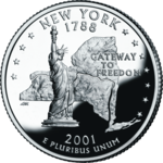
36. New York
- Depicted: Statue of Liberty, 11 stars, state outline with line tracing Hudson River and Erie Canal
- Caption: "Gateway to Freedom"
- Year Released: 2001
- Analysis: The Statue of Liberty and an outline of New York was all this coin needed, and everything else is too much. An outline of the Erie Canal? A waterway that hasn't been relevant since trains became a thing? Who cares? Also, like with New Hampshire, it decided that it needed to put a number of stars on the coin to depict which state it was to join the union (11th). Again, nobody cares.
35. Tennessee
- Depicted: Fiddle, trumpet, guitar, musical score, three stars
- Caption: "Musical Heritage"
- Year Released: 2002
- Analysis:Tennessee is acting like they invented all music with this coin. Whatever. Grand Ol' Opry. Elvis. Yeah, I guess you're somewhat associated with music. There are a lot of states in the south that could have a fiddle on it though. It's the universal musical instrument of rednecks.
34. Indiana
- Depicted: IndyCar, state outline, 19 stars
- Caption: "Crossroads of America"
- Year Released: 2002
- Analysis: I guess the Indianapolis 500 is the only thing this state has (other than the Terre Haute Federal prison's death chamber, which I can't imagine being put on a coin even though it would be AWESOME). What else was it going to put there? But let's be serious. Is Indiana really the crossroads of America? And isn't it dangerous for an IndyCar to be on the crossroads? Those things go way too fast for intersections.
33. Alabama
- Depicted: Helen Keller, a longleaf pine, branch, magnolia blossoms
- Caption: "Spirit of Courage", "Helen Keller" (in English and Braille)
- Year Released: 2003
- Analysis: Surprisingly, Helen Keller (despite being blind, deaf and mute) is actually still the most educated, well-spoken and literate person to ever come out of Alabama. Just watch and Alabama politician or listen to a Lyndyrd Skynyrd song and you'll know that's true. Also, Magnolias just like the Mississippi coin. I mean you get props to attempting to display a notably Alabaman that people actually like, and for putting braille on a coin, but honestly all I can think of now is Patty Duke screaming "Waaa waaa" in The Miracle Worker. The 1962 version, of course. She was Annie Sullivan in the 79 TV Movie version which had no reason to exist or ever be made. Seriously though, putting Braille on a coin is probably the most progressive thin that Alabama has ever done. I figured Alabama's coin would probably just be a burning cross.
32. Idaho
- Depicted: Peregrine falcon, state outline with star indicating location of Boise
- Caption: "Esto Perpetua" ("Let it Be Forever")
- Year Released: 2007
- Analysis: I'm not digging this one. I like hawks, but why is this, like, a bust of a hawk's top half, rather than an entire hawk in the air? Are busts of birds a big thing? I also don't think of hawks when I think of Idaho. I think of potatoes. Wisconsin at least had the courage and self-acceptance to recognize that it should have a big wheel of cheese on it (you'll see later), yet Idaho won't own up to only being famous for potatoes... and white supremacist Californians who retire there because there are "too many brown people" moving in? When I think of a hawk on a coin, I think that coin should belong to some sort of cool Middle Eastern country famous for falconry and Bedouins. Also, it looks like the giant hawk is about to eat the tiny Idaho on the coin. And why is Boise shown with a star? No other state that did an outline of it was like "and here is our capital!" This isn't a high school quiz. The bird looks cool, but it doesn't scream "Idaho" to me at all.
31. Kentucky
- Depicted: Thoroughbred racehorse behind fence, Bardstown Mansion, Federal Hill
- Caption: "My Old Kentucky Home"
- Year Released: 2001
- Analysis: Obviously Kentucky was going to depict a racehorse since it doesn't have the balls to display a jug of bourbon. This is an okay coin, but I'm not digging the mansion. It's too much. A horse on a farm would have been enough.I don't need the mansion. Or better yet, a depiction of a horse race, with two horses neck-and-neck. Seriously though... bourbon. That would be nice.
30. Hawaii
- Depicted: Statue of Kamehameha I with state outline
- Caption: "Ua Mau ke Ea o ka ʻĀina i ka Pono" ("The life of the land is perpetuated in righteousness")
- Year Released: 2008
- Analysis: The final state, and the last of the state coins, belongs to Hawaii. As I implied when discussing why Oklahoma's coin failed, it was wise for Hawaii not to do a rainbow because that simply wont work on a coin. That being said, there were many better options to go with other than a depiction of a STATUE of Kamehameha. For example, why not try to actually directly depict Kamehameha instead of depicting a statue of him. There could have been dozens of other choices though. Beaches with palm trees. Plumeria flowers. Yellow Hibiscus flowers. Diamond Head State Monument (maybe in the background, with a beach in the foreground). Some other notable volcano. Hula dancers with leis. Pineapples. Someone surfing (Duke Kahanamoku or Eddie Aikau, preferably. Bethany Hamilton getting her arm eaten off by a shark would probably be a bad choice). An outrigger, Hōkūleʻa, or other traditional Polynesian sailing vessel. Israel Kamakawiwoʻole playing a ukulele wouldn't have been a bad choice either. Hawaii's coin isn't terrible, but it could have been much better (as later US Territories quarters from other Polynesian places like Guam, American Samoa, and the Northern Mariana Islands would prove).
29. Utah
- Depicted: "Golden" spike, Locomotives Jupiter, No. 119, and the completion of the Transcontinental Railroad
- Caption: "Crossroads of the West"
- Year Released: X
- Analysis: Why does every state want to be "The Crossroads?" New Jersey was "Crossroads of the Revolution." Indiana was ""Crossroads of America." Now we have the "Crossroads of the West." Yes, the Transcontinental Railroad was indeed completed here, and the spike was put in the ground (which, of course, you can't tell is golden on this silver coin). It's like someone watched the film Wild, Wild West and thought it would be cool to have the golden spike ceremony depicted on this coin too. I dunno. Trains are cool, but this coin could have looked a lot more visually appealing.
28. Colorado
- Depicted: Longs Peak
- Caption: "Colorful Colorado"
- Year Released: 2006
- Analysis: Nothing like a silver monotone depiction of a boring mountainside (which would just be gray and brown anyway) being described as "colorful." It's not an ugly coin overall, but it's a little "blah." And it is not, at all, colorful. Again. Follow the "Oklahoma rule" and don't try to depict something colorful on a monotone palette. Also, this Longs Peak is so generic looking it could be a fictional rock formation.
27. New Jersey
- Depicted: Washington Crossing the Delaware
- Caption: "Crossroads of the Revolution"
- Year Released: 1999
- Analysis: It's a little odd that New Jersey chose Washington crossing the Delaware River as its choice, considering that the name of ANOTHER STATE is more prominent in the theme, and the crossing of the Delaware River also involves another state, Pennsylvania, from which Washington's plan was actually launched. In fairness though, yes, this Christmas-night surprise attack led to a victory against Hessian forces at the Battle of Trenton (in New Jersey) on the morning of December 26, so... yeah... New Jersey. Still though, this is mainly based on a depiction of the crossing from a famous painting, and there is just too much damn small, minute detail that doesn't really work on a small coin. If you look at it closely, you have to actually know and recognize the painting to be able to tell that this coin represents that event, because otherwise what's on the coin is just sort of blotchy and un-detailed. An ambitious choice that doesn't totally work.
26. California
- Depicted: John Muir, California condor, Half Dome
- Caption: "John Muir," "Yosemite Valley"
- Year Released: 2005
- Analysis: Look, I'm an environmentally aware and considerate person who even took an environmental science course in college. I respect the decision to put John Muir on a coin. I even dedicated a weekend back in the day volunteering to do phone calls for the Sierra Club. Still though, California has so many options for what they could have put on their coin that I'm sort of disappointed that an old main staring at a rock is what they went with. And neither John Muir, nor the Half Dome (a feature in Yosemite National Park) are famous enough so that they can survive on their own, so this time the captions are absolutely needed so that people aren't asking "What the hell are these things?" I'm not saying that California's coin should have been the Golden Gate Bridge, the Hollywood Sign, or Grauman's Chinese Theater. If they picked something from one specific California city rather than another, I could see how people from the other cities would be pissed. But even if going for some nice environmental scene, they could have picked some better choices. How about the redwoods? It might be hard to pull off that on a small coin, but it could be done. Even in Yosemite, the El Capitan cliff is more iconic than Half Dome (I'd argue) and could have been depicted instead. In fact, it WAS depicted later (in 2010) when they issued the America the Beautiful quarters based on National Parks. California blew this one like a struggling actress on a casting couch. Which, honestly, also could have been depicted on the coin as a more accurate representation of the state.
- Depicted: Bucking Horse and Rider
- Caption: "The Equality State"
- Year Released: 2007
- Analysis: Wyoming is definitely the Equality State. Unless you're a woman. Or Black. Or Hispanic. Or anything other than a white, conservative male. But other than that, totally the Equality State. Also, this coin is trying too hard to be like "Yeah, we're cowboys!" Texas avoided such an obvious depiction, but Wyoming couldn't resist it. It doesn't even look like a proper depiction of a cowboy that someone put a lot of work into. It looks like a silhouette of a cowboy that would appear in neon on the side of a saloon and/or strip club called "Annie Oakley's Roadhouse." I appreciate the simplicity and the concept, but this is a straight up middle-of-the-road state coin.
24. Kansas
- Depicted: Bison, sunflowers
- Caption: None
- Year Released: 2005
- Analysis: A bison is a damn fine thing to put on a coin, such as the iconic "Buffalo nickel." However, this bison is at an odd angle. And the sunflower isn't totally needed. Still, Kansas at least had the common sense to know that their depiction was straight forward and didn't need a caption like "American Bison." People in Texas are like "Durrr, what is this? Oh yeah! The Lone Star State... because it says so!" Kansas kept it simple, but the design of the bison could have been a bit sleeker. And without those weird legs that vanish into the grass and therefore look like odd chicken drumsticks. Or perhaps... buffalo wings? *rimshot?* Seriously though, Clark Kent should have been on the Kansas coin. Everyone knows that.
23. Washington
- Depicted: Salmon leaping in front of Mount Rainier
- Caption: "The Evergreen State"
- Year Released: 2007
- Analysis: The salmon is cool, but the depiction of Mount Rainier could have been done a little better. I know it's hard to depict a snow-capped mountain on a one-color coin, but this coin especially doesn't do a good job. Not a terrible coin, but not a great one either. That's why it's here in the middle at #23. Also, the little "sploosh" of water under the fish doesn't look right either on a small coin.
That's it for now. Next time we get to coins that are finally good ones and maybe I'll stop making fun of them so much. I hope that makes you feel better, in case you were feeling bad for the quarters.
No comments:
Post a Comment