63. Asparagus - Are there enough people out there demanding the proper shade of green to draw asparagus with?
62. Chestnut - You're not slipping this past me. This racist color used to be known as "Indian Red," and giving it a name change doesn't make it any less terrible.
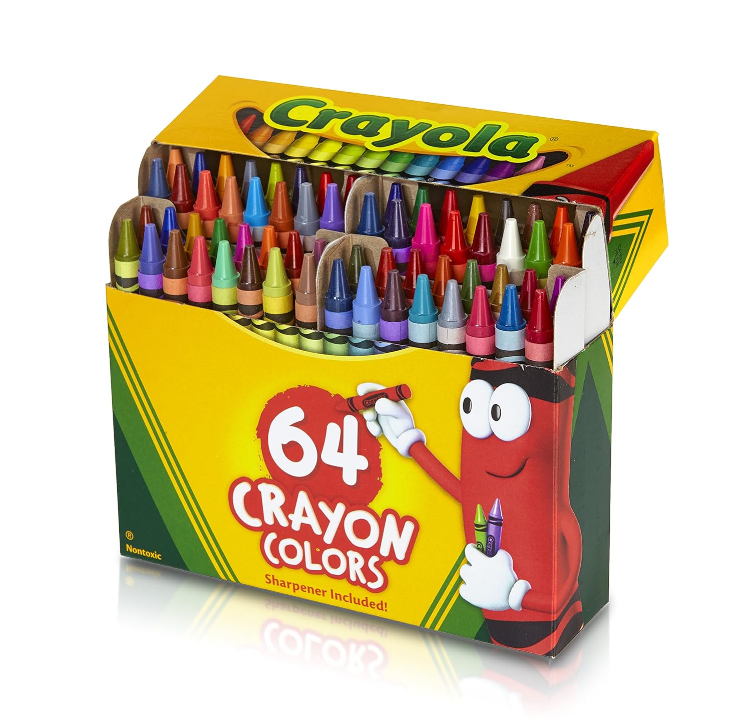
61. White - Who actually uses the white crayon? I mean come on.
60. Tickle Me Pink - Tickle me a terrible name.
59. Dandelion - why does this color exist? It looks exactly the same as "Goldenrod."
58. Yellow - Who's favorite color is yellow? Nobody. That's who.
57. Spring Green - Does this look green to anyone? This could be renamed "the color of partially digested corn after you vomit it up."
56. Lavender - This crayon is pastel pink. It is not lavender. Between 1949–1958 Crayola had a color that was named lavender that was actually lavender. What happened here?
55. Wisteria - If you're going to have a light purple color there are many things you could name it. Naming it after a filthy, disgusting weed is not a good option. You should take this color and rename it "lavender" and take that existing lavender in the box and throw it in the garbage.
54. Gold - Gold should be an awesome color like Silver is, but unfortunately what Crayola calls "gold" I'd describe as "Greenish-Brown."
53. Bittersweet - AKA Orange-ish Pink. That's just what we needed. Yet another pinkish hue. This is only a box of 64. Just how many pinks are you trying to put in here?
52. Apricot - Why? We already have Peach. This hardly seems necessary.
51. Periwinkle - Oh no! We dipped a blue crayon into a batch of white crayons! Whatever shall we do? Maybe just sell it as this color that absolutely no child ever uses to draw anything with.
50. Salmon - Quick! Better throw another shade of pink in the box! We only have 26 different shades of pink in there so far.
49. Melon - Quick! Better throw another shade of pink in the box! We only have 27 different shades of pink in there so far.
48. Magenta - Quick! Better throw another shade of pink in the box! We only have 28 different shades of pink in there so far.
47. Orchid - Quick! Better throw another shade of pink in the box! We only have 29 different shades of pink in there so far.
46. Carnation Pink - Quick! Better throw another shade of pink in the box! We only have 30 different shades of pink in there so far.
45. Violet-Red - Quick! Better throw another shade of pink in the box! We only have 31 different shades of pink in there so far.
44. Wild Strawberry - Quick! Better throw another shade of pink in the box! We only have 32 different shades of pink in there so far. Strawberries are red. Not pink. Come on now.
43. Granny Smith Apple - A pastel that only the people with poorest taste would paint their house with.
42. Sea Green - If you ever see a body of water that is this color, I recommend not going into it. This is not what the sea should look like.
41. Cadet Blue - Oh no! We dipped two blue crayons into a batch of white crayons! Whatever shall we do? Maybe just sell it as this color that absolutely no child ever uses to draw anything with.
40. Olive Green - Maybe in the Mediterranean the kids are always drawing olives, but I honestly can't think of an occasion where I'd ever need this color.
39. Robin's Egg Blue - Unless you're drawing the clothes you give to a baby boy, it is unlikely that you will ever use this color.
38. Tumbleweed - First off, Tumbleweed is a dumb name. But the color itself isn't that bad because it's essentially just a slightly lighter tan. And I can see occasions where one would need their tan to be slightly lighter.
37. Mahogany - You can use this color to draw wood, but only if you want everyone who looks at your drawing to think that your wood is stained with the blood of murder victims.
36. Indigo - AKA Mediocre Blue.
35. Green-Yellow - Which has no green in it at all that I can discern. This color has no point.
34. Yellow-Green - At least this one looks like a combination of yellow and green.
33. Yellow-Orange - Nobody cares about this color. Until 1990 there was also an unnecessary Orange-Yellow.
32. Red-Violet - do we really need a Violet-Red AND a Red-Violet? What kind of trick is this?
31. Sepia - Planning on drawing an old west "Wanted" poster? Great! There is a crayon specifically for that purpose and nothing else.
30. Burnt Orange - Multiple shades of orange was really unnecessary. And who ever cooks oranges enough to burn them anyway?
29. Blue-Green - Pretty much useless because Pacific Blue is better.
28. Forest Green - I would honestly never choose this color to draw trees.
27. Burnt Sienna - Sienna seems like a boring color that became obsolete after we started advancing beyond grinding up rocks from the ground to make our pigments.
26. Raw Sienna - Of the two siennas, this one is slightly better.
25. Red Orange - Why not? We have a ton of other lazy colors that are just two other colors combined. At least this one looks like red and orange combined.
24. Sky Blue - Sure. Everyone needs to draw the sky, right?
23. Cornflower - Planning to draw Dorothy from the Wizard of Oz? Good news! Crayola made this color just for her dress.
22. Plum - Eh, Plum is okay. Nothing to write home about.
21. Gray - There is no place for Gray to be other than sort of in the middle of the pack. I mean it's just gray.
20. Blue-Violet - A version of purple that looks a little grayish, actually. Until 1990 there were both a Blue-Violet and a Violet-Blue. Again, totally unnecessary.
19. Brick Red - I could mock this, but this is a pretty practical color to have.
18. Scarlet - Slightly brighter red? Okay. I guess I'll use this color if drawing a red sports car?
17. Pacific Blue - This is the color you want to draw your water with. Forget worthless Sea Green.
16. Tan - Tan is, like, just light brown. So it's very useful for when you need to draw brown things that are a little less brown.
15. Turquoise Blue - I always grab this one instead of Sky Blue. I have no idea why, because they are pretty much exactly the same.
14. Peach - this color is that you use to draw white people with, which is why it was called "Flesh" until someone informed Crayola that other races exist.
13. Goldenrod - Just use this color when you're drawing yourself winning gold medals, because that normal color they call "Gold" is a joke.
12. Cerulean - This color is great because it sounds like some kind of alien from Star Trek. OH NO! Commander Riker did WHAT with the Cerulean Ambassador's wife?! That cad!
11. Orange - The basic colors are the classics, and orange has its uses at times. Sort of.
10. Silver - Gold may be worth more than Silver, but the Silver Crayon is so much cooler. You get to draw fancy robots with it in a way you never could before with just boring gray.
9. Brown - You can draw so much stuff with brown. So versatile. Don't hate on brown. Although the Crayola version does slightly hint on the "too red" side of the spectrum for my tastes.
8. Green - Green is a great color. I mean how much more do I have to say?
7. Timberwolf - Naming a color after an apex predatory canine that tears the flesh off of furry animals is a solid way to make it escalate to the top of the ranks.
6. Purple Mountain’s Majesty - The most patriotic color, bar none.
5. Macaroni and Cheese - The most delicious color. Admit it. You've licked this crayon too, even though you knew better.
4. Blue - The basic colors are always the best. All these fancy shades of blue will never be as good as the original.
3. Red - Red is a great color. You can draw so much blood with it.
2. Black - You always use the black crayon, no matter what you're drawing. If you don't, then you're a terrible child and don't know how to draw.
1. Violet (Purple) - Purple is the best color. There is no valid opposing argument. It's all royal and regal and majestic.

No comments:
Post a Comment